Materials List:
- Derwent Inktense Pencils, Blocks and Paint Pans: 200 Sun Yellow, 240 Sienna Gold, 510 Cherry, 600 Shiraz, 610 Red Violet, 1500 Field Green, 1540 Light Olive, 1600 Leaf Green, 1800 Baked Earth, 1900 Willow, 1920 Madder Brown
- Hero Arts Hero Hues Cardstock: Lapis, Dove White, Cranberry, Sand, Eggplant
- 140# Coldpress Watercolor Paper, 100% cotton preferably
- Nuvo Glacier Paste: Winter White
- The Carnival mask is an SVG file from Etsy, loaded to Cricut
- Hero Arts Cheeky Birthday Stamp Set
- Pretty Pink Posh Birthday Sentiment Stamps and Dies
- Gina K Designs Fizzy Stencil
- Altenew Gerbera Revolution Stamp Set
- Altenew Watercolor Coloring Book
- Spellbinders Stacked Decorative Edges Die Set
- Waffleflower Birthday Kitties Combo
- Sizzix Nesting Scalloped Circles
- Gina K Designs Master Layouts 2
- The Stamp Market Heart & Hugs Die Set
- Altenew Wavy Outlines Die Set
- Wow! White Pearl Superfine Embossing Powder
- Ranger Glossy Accents
- Versafine Clair Pigment Ink – Nocturne
- Altenew Mixed Media Ink – Grapevine
Wow, so many cards! Again, I went a little crazy with the cardmaking for this post/video. You can check out the 30 minute video HERE on YouTube for more detail.
I’ve been working with Inktense products for a few months now in my painting and cardmaking. The colors are so vibrant and intense, it is really exciting to see the pieces come to life when you add water! Just a bit of background on Inktense. It is a wax-based product, like colored pencils, but the formulation allows the ink to react with water to “activate” much like a watercolor product. Once the product is wet it will dry to a “permanent” state. That is in quotes because I, and other artists/YouTubers have definitely shown that you can sometimes move the product after it is dry. More on that in the next post…
What I really love about Inktense is the ability to use the product in so many different types of applications because the color stays true between products AND the products behave differently depending upon the technique you are using, the paper you use, etc. So I’ve been able to switch between products using the same color without any issues with color matching. Brilliant!
Here’s how I used these Inktense products in the cards.
I used both the 510 Cherry pencil and paint to create watercolor backgrounds for two of the cards. I used watercolor paper for both of the cards. With the pencil, I laid down a light layer of ink directly on the paper, then went back over some areas of the paper to apply more ink/more pressure on the pencil. This results in deeper areas of color once the ink is activated with water. I then used clean water and a size 8 round watercolor brush to activate the ink. This is a great method to get a nice watercolor background for cards, but I much prefer the next method!
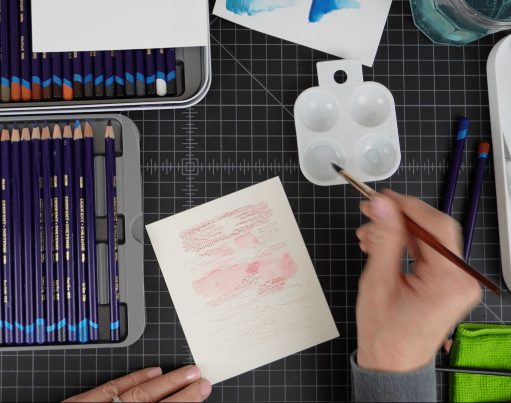
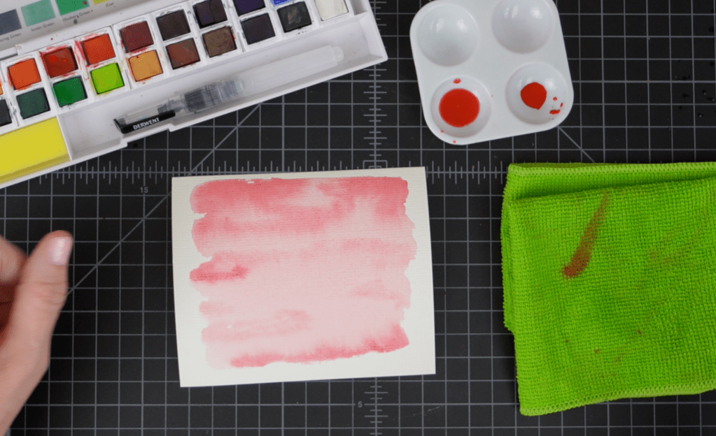
For my second panel I used the paint pans, again using Cherry ink. For this panel I mixed two different saturations of ink in my palette, one a light wash and the other a deeper more pigmented color. I started by laying down the lighter wash with a large brush and WHILE THE PAPER WAS STILL WET (VERY IMPORTANT, HENCE THE CAPS!) I went back in with the darker color and laid down some ink in a few areas to create some shadows and areas of interest.
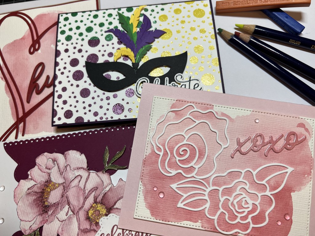
With the two panels I created the Hugs card and the XOXO card.
Hugs Card:
This card was super quick and I love the craft cardstock/red cardstock combo. I trimmed the watercolor panel down to 4 x 5 1/4″ and glued that panel to a 4 1/8″ x 5 3/8″ Cranberry cardstock panel. The two overlapping hearts are from The Stamp Market’s Heart and Hugs die set. I’ve just started shopping The Stamp Market and I am really impressed with their products. Let’s just say I now have many more possibilities for Valentine’s Day/Anniversary cards. I die cut two hearts and two hugs die cuts from the same Cranberry cardstock. I ran the hugs die back through my Gemini Jr on Sand cardstock and that is literally all the pieces you will need to make this card. I LOVE simple and cute cards. I can get as overblown as the next person with my cardmaking and sometimes it is just really nice to keep it CAS, right? So, to assemble the card I slightly overlapped the heart die cuts (see photo above) and then used a combo of glue and tiny snips of foam squares to adhere the hugs die cut (stacked and glued together with the sand cardstock on the bottom to create a slight shadow) overlapping the heart on the right.
XOXO Card:
Another sweet and simple card, and my favorite of this series. I used the larger stitched rectangle frame from Gina K Designs Master Layouts 2 to create a stitched border on my watercolor panel. I had some die cuts from Altenew’s Wavy Outlines die set. I had die cut them on layering weight white cardstock. So I stacked two of each die cut together and used the single rose and the rose with two leaves to create a floral image on the front of the card. It looks so sweet against the pink watercolor background. For the greeting I die cut the XOXO die from The Stamp Market’s Heart and Hugs die set. I cut this from another pink watercolor panel I made as a “test” panel when testing out the paint pans. I always save those panels, I never know when I will need just a scrap of something! So, after stacking two XOXO die cuts I heat embossed this greeting with Wow! White Pearl Superfine Embossing Powder. I love love love this embossing powder. The pearlescence really complimented the softness of this card.
Mardi Gras/Carnival Mask card:
My son and husband both ride in parades at Mardi Gras so I’ve been a frequent visitor to New Orleans during Mardi Gras. It’s such a fun time and the friend group we travel with make for a very lively party. It is that time of year so my thoughts naturally turned to the purple/yellow/green color scheme of Mardi Gras. For this card I wanted to use the Gina K Designs Fizzy stencil because it looks like a party! I don’t keep a lot of pastes on hand because I don’t use them enough to warrant the risk of $$$$ versus dried up paste. However I have discovered a way to keep a few colors/types of pastes on hand and then tint those pastes to my desired color. I did not invent this method, I saw another cardmaker do this in a video, I think it was Marian Emberson but I honestly can’t remember. Regardless, here is the method:
METHOD: Choose an Inktense block (or blocks) for your paste color. Using a craft knife or a mini grater, finely shave or grate a small amount of the block onto a cutting board or silicone surface.

You want to use a white surface so you can see if the color is correct and your ink has completely blended. Estimate the amount of paste you will need for your project and place that paste on your surface. Using a craft spatula mix the ink and paste thoroughly. I find that folding and pressing firmly into the paste helps to blend the mixture quickly and thoroughly. You’ll want to work quickly as the paste will start to thicken. This stuff starts to dry quickly. Note: If you are blending two colors of blocks you might swatch the blended color on some watercolor paper before mixing it into your paste. You can then use the tinted paste on your project. Needless to say I have several jars of Nuvo Glacier Paste in Winter White and I’m not at all concerned that it will be wasted.
For the front panel I used the Fizzy stencil to add three different colors of paste that I created using the method above. I let each color dry before applying the next color because I’m careful that way but I suppose you could leave the stencil in place and then mix up the next two colors and apply all in one go. My method prevented the paste colors from mixing while wet but mixing at the borders might be a good look? For the mask cut out I had to go to the interwebby to find an SVG file that I liked. This one is from SVGVectorMonster. I paid my $1.99 and downloaded the file to my Cricut. I used a combo of purple, green and yellow cardstock for the feathers on the mask and the mask is a heavyweight black cardstock. I assembled the mask with glue then used foam squares to pop it up on the Fizzy panel. The greeting is from Pretty Pink Posh’s Birthday Sentiment Stamps & Dies. I stamped this on heavy white cardstock using Versafine Clair Nocturne ink, then stamped once more with clear embossing ink and heat embossed with clear embossing powder. I used a combo of glue and tiny foam squares to adhere the greeting at the bottom right on the mask, slightly overlapping. The Fizzy panel is cut 1/8″ smaller than the A2 card base so 1/16″ of the Eggplant base shows on all sides of the front panel. I created a white inside panel for the card that is 4″ x 5 1/4″. I used the confetti and streamers stamps from the Hero Arts Cheeky Birthday stamp set to stamp some fun party images using Stampin’ Up! ink in Gorgeous Grape, Daffodil Delight and Garden Green. This is such a festive card, I love the vibe!
Peony Card:
The 4th card is a floral watercolor-like card using an image from Altenew’s Watercolor Coloring Book. I used 220 Sicilian Yellow and 600 Shiraz Inktense pencils to color the flower. These pencils have such an amazing gradient of color it is totally possible to get this depth using only two colors.
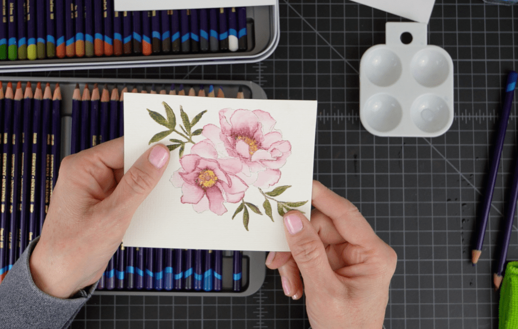
The leaves were colored using 1550 Spring Green, 1600 Leaf Green and 1730 Oak. I layered the colors then used a very small #2 watercolor brush to activate the ink, taking care not to overblend the colors. I didn’t have a die for this (boo) so I had to fussy cut (another boo) but I have a trick to make your fussy cutting look so much better! After fussy cutting use a damp finger to go around the edges of the image to smooth out any rough places where your cutting wasn’t exactly smooth. Then take a colored pencil or copic marker, whatever you have in a light coordinating color and go around the edges of the image on the edge of the paper. This takes away any glaring white spots that maybe weren’t cut perfectly. You’ll be amazed at how much better your fussy cutting looks!
For the background image I used a die set that I received from my son for Christmas. I think this was from Amazon. It has loads of nesting frame dies. I used one of the larger dies to cut a frame for my flowers (I think these are peonies, not sure.) After playing around with the placement on the card front I ultimately decided to cut the frame in half and I used a border die from the Spellbinders Stacked Decorative Edges die set to create a pretty edge on each piece. I switched them around on the card front to create a vase-like look and then adhered my flower image with foam squares in the center of the die cut “vase.” For the greeting I stamped the “Celebrate” and “Your Big Day” stamps on white cardstock with Altenew Grapevine Mixed Media ink. I stamped these separately so I could get the spacing just right. I die cut the greeting with a small matching die from the ornate frame die set. The greeting was adhered with tiny foam squares and small amount of glue where the greeting overlaps the flowers. At the last minute I added some water drop embellishments for a bit more interest. I think this would be a beautiful card for Mother’s Day or a birthday.
Leaf Card:
In my YouTube video I show how I created the leaf panel but I didn’t video the assembly process. Here is the card:
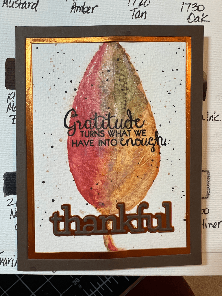
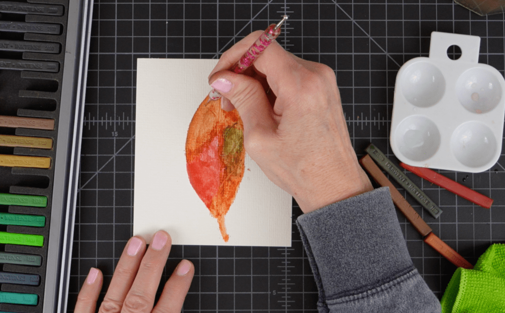
For the panel I used Inktense blocks in 500 Chili Red, 1600 Leaf Green, 1800 Baked Earth and 1900 Willow to freehand sketch the leaf shape. I applied the block color directly to watercolor paper, slightly overlapping some of the colors for added depth and some blending.

These blocks feel and act much like pastels but they are very water reactive and “permanent” when dry.
I then went back over the drawing with a wet watercolor brush, taking care to clean my brush between colors unless I wanted more blending. I added additional layers of ink and activated with water until I had an image that I liked. Before the image dried I used a ball stylus to create vein shapes in the leaf by pressing the stylus into the ink and using it much like a pencil to “draw” the veins.
After the panel was dry I trimmed it down to 4 1/4″ x 5 1/2″ and then used a dark shade of 1740 Saddle Brown and 2020 Indian Ink mixed with a tiny bit of water and created splatters on the panel. For some added interest I applied a tiny amount of Inka Gold in oldsilver using just my finger and a paper towel for buffing. For a greeting I used both die cuts and a stamp. For the die cuts I used CZ Design’s Thankful 1 greeting and shadow die set. I cut the greeting from Hero Arts’ Chestnut cardstock and the shadow layer from Recollections copper metallic cardstock. The greeting stamp is from Colorado Craft Company’s Gratitude Slimline stamp set. I love really large greetings that take up some real estate on the front of a card. I used these same cardstock colors to cut the rectangle frames for the image using Waffle Flowers’ A2 Layers Dies. This is a great card for Thanksgiving/fall and I’ll probably make a video later this year on the whole process.
I have one more Inktense video coming up this week and this one is all about paper choices and how Inktense products perform on different types of paper. I hope you’ll tune in on YouTube to check out the video. Please subscribe to my channel so you will get a notification when I post a new video!
Cheers!
Cynthia
