Distress Ink Background (see my last blog post for details on creating these)
Spellbinders Build a Spring Birdhouse die set
Spellbinders Birds on a Branch die set
Spellbinders Mini Everyday Sentiments stamp set
Spellbinders Sentiment Labels die set
Spellbinders Glimmer Foil in Moondust
Distress Spray Stain – Black Soot
Distress Oxide – Faded Jeans, Mowed Lawn
Black liner pen for bird detail (3 mm chisel tip, use the point)
Patterned paper for the birdhouse
Hero Arts Premium Cardstock – Mustard, Chestnut
Scrap of white cardstock for die cutting flowers
Pops of Color! Pearl Satin, Black
Copic Markers – Assorted bright colors
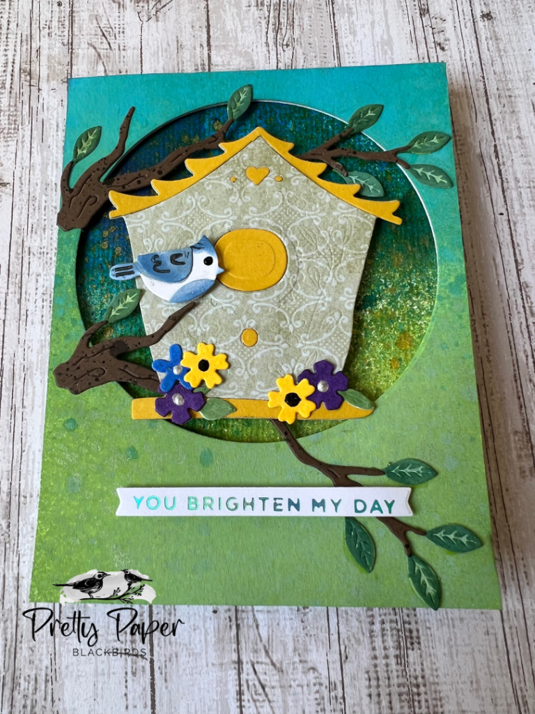
This is the card that started the whole inky background project I posted earlier today. I fell in love with these landscape panels and quickly found lots of uses in my cardmaking. But here is how I put this birdhouse card together.
From my growing stash of inky backgrounds I chose one that had a sky area, some green down below for a field or meadow, and some splashes of yellow for sunshine. You can trim this panel down if needed so that the perfect “scene” shows through the die cut circle that you will soon cut from a piece of heavy white cardstock. I took that A2 cardstock piece and taped a circle die that measures 3 3/4″ in diameter to the cardstock. This was centered horizontally but about 1/2″ from the top of the panel. See photo above for placement. I die cut the circle then pulled out some Distress Oxide ink pads and inked the panel. Starting at the bottom I applied Mowed Lawn from the bottom up, covering the bottom 2/3 of the panel. I then applied Salty Ocean to the top 1/3 of the panel. Next I lightly sprayed Wicked Elixir Distress Mica Stain to create some contrast on the lower part of the panel (over the Mowed Lawn.)
For the birdhouse I searched through my patterned paper stash for a fun wallpaper pattern. The Ideaology Wallflower Paper Stash had several great choices. I decided on this flourished green paper and used that to die cut the birdhouse from the die set. I then die cut a second birdhouse from the Mustard cardstock and trimmed off the roof and perch for my patterned paper birdhouse. I also used the small heart, the two dots on each side and the circle (above the perch) from the Mustard die cuts. I applied foam tape to the back of the birdhouse and then used the sticky part of the tape that was showing through the cutouts to adhere those pieces.
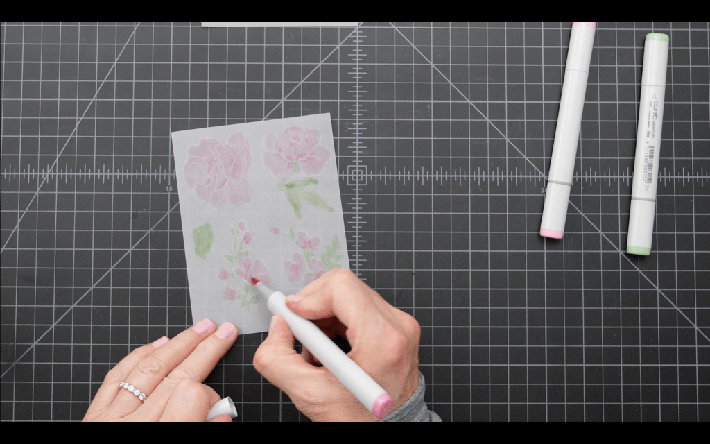
Next I die cut the branches from the Chestnut cardstock, and the flowers and leaves from white cardstock. For the branches I simply put them in my spray box and applied a light mist of Black Soot Distress Spray Stain. That gave enough contrast and depth to the pieces. I inked the flowers with several colors of bright Copic markers and applied Pops of Color in Satin or Black to the centers. I inked the leaves Distress Oxide Spray in Mowed Lawn, then went back over the leaves with Distress Ink in Mowed Lawn to create some contrast in the raised areas.
I chose the cute little bluejay die cut for my bird. I cut the bird from white cardstock, and using a google search I replicated the blue markings with a really small blending brush (Altenew #5) and a Faded Jeans Distress Oxide ink pad. I used a Kingart Inkline pen to create the black markings and a Pops of Color in black for the eye.
For the sentiment strip I used the Spellbinders Mini Everyday Sentiment foiling set to foil You Brighten My Day on white cardstock. I die cut the strip with the included sentiment strip die and the strip is popped up on the face of the card with foam tape.
To assemble the card I first attached the leaves to the branches and then attached the branches to the die cut front panel, since those appear behind the birdhouse. I then attached the bird to one of the branches and attached the flowers and leaves to the perch of the birdhouse using glue. I then attached foam tape strips to the back of this panel and adhered the panel to my inked background. I then removed the backing from the foam on the back of the birdhouse and positioned it in the center of the circle. I attached my sentiment and the card was complete.*
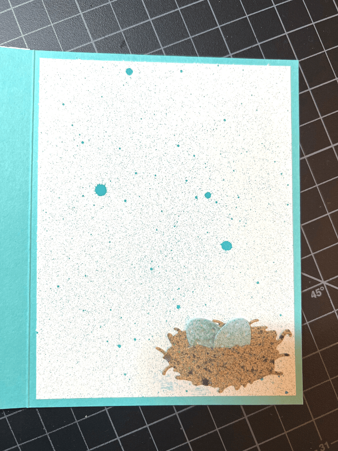
I wanted to create a cute panel for the inside of the card so I die cut the nest and eggs from the Build a Spring Birdhouse set. I inked the nest in Brushed Corduroy Oxide ink and then sprayed lightly with Black Soot Spray Stain. For the eggs, I inked in Speckled Egg and then added a tiny bit of Perfect Pearls in Perfect Gold for some shimmer. I attached these to a 4 x 5 1/4″ white panel and then lightly sprayed the panel with Peacock Feathers Distress Oxide Spray. It makes a super cute inside panel!
Let me know if you have created some backgrounds and how you are using them!
Watercolor paper, 140# cold press ( I used Arteza for this project. It is inexpensive and you’ll need LOTS)
Altenew Lotus stamps and dies
Globeland Butterfly Celebration foiling set
Hero Arts Big Hugs stamp and die set
Spellbinders Mini Everyday Sentiments (foiling set)
Spellbinders Sentiments Labels die set
White A2 cardbases – I used top fold portrait and landscape.
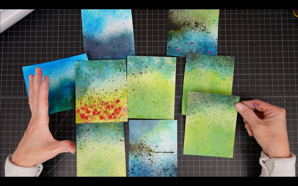
This was a super fun and very messy project! Keep lots of paper towels handy and be sure to precut lots of your preferred size of watercolor paper in advance (I used slightly larger than A2 and cut the panels down as I was creating the card fronts.)
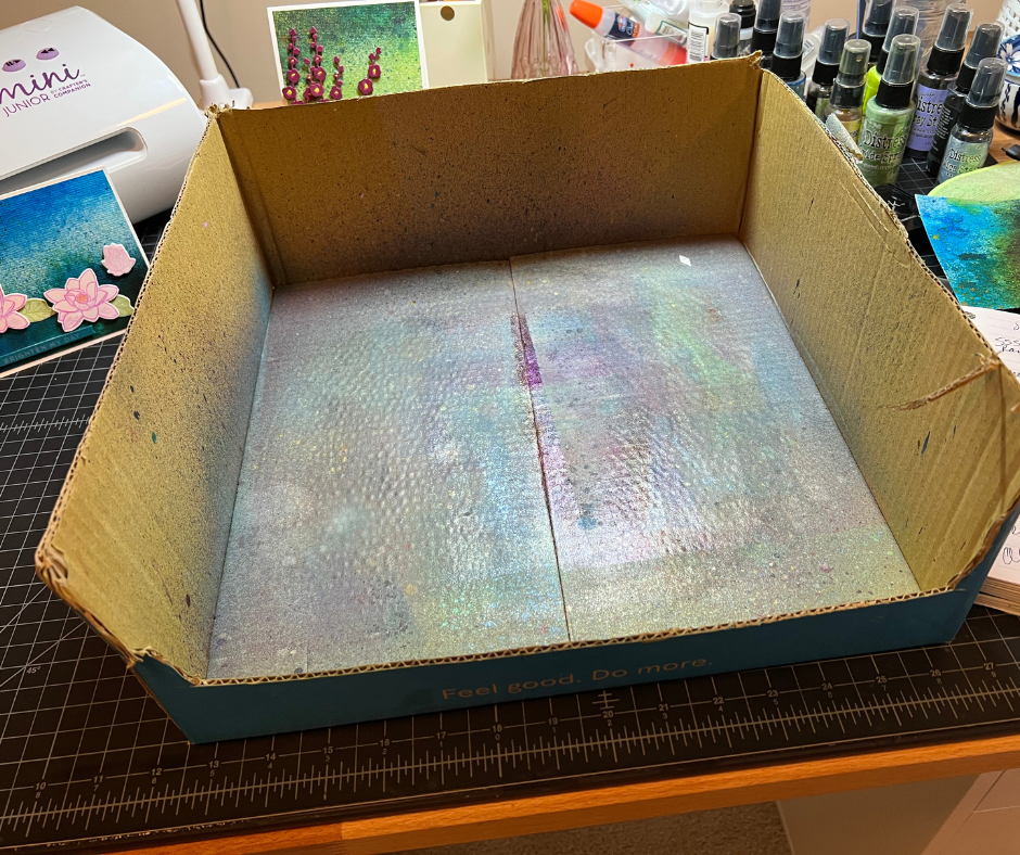
You’ll need a spray box for this project and I recommend my 100% free spray box. Go out to your garage and find a box that is about 13 – 14 inches square and 6 or so inches tall. Cut off the top flaps and cut a semi-circle from the front. That is all you need for a spray box. Place a clean paper towel in the bottom when you start a project and it will work perfectly. Here is my (well used) spray box.
For my panels I was going for an impressionist landscape look. I chose Spray Stains and Oxide Sprays that would be found in nature, like Mowed Lawn, Salty Ocean, Forest Moss…I wasn’t super careful about where I sprayed. The fun in this technique is that you don’t really know exactly what you will get and no two panels are alike, no matter how hard you try to replicate exactly what you did with the last panel.
Starting with the panel on the far left (because it was my favorite) I was going for a water area at the bottom and a lighter sky area at the top. I wanted to use this panel as a background for some die cut and stamped lotus flowers in a light pink and I thought the different blues would really help to showcase the flowers. I started with a watercolor panel on a clean paper towel in my spray box. I misted the panel with water from my mini mister and then sprayed salty ocean at the bottom and the top. I lightly misted with water again and then dried the panel with my heat tool. To create some depth and layers I then sprayed the water area at the bottom with Uncharted Mariner, lightly misted with water and dried this area again.
NOTE: Spraying wet over dry will create layers of color with “some” blending. Spraying wet over wet will create “some” layering but mostly blending. Spraying water over dry ink will result in a splatter effect. These are all wonderful effects. Experiment with all of them to see how these stains and oxides react.
To create a bit of green in the water area I sprayed a “timid spray” of Harvest Moon at the top of this area and then immediately misted with water. This created a blended effect with the blue ink and, voila! I had a hint of green in my water. I created a darker blue shadow on the bottom right of the panel by spraying a bit more Uncharted Mariner in this area and drying (no water.)
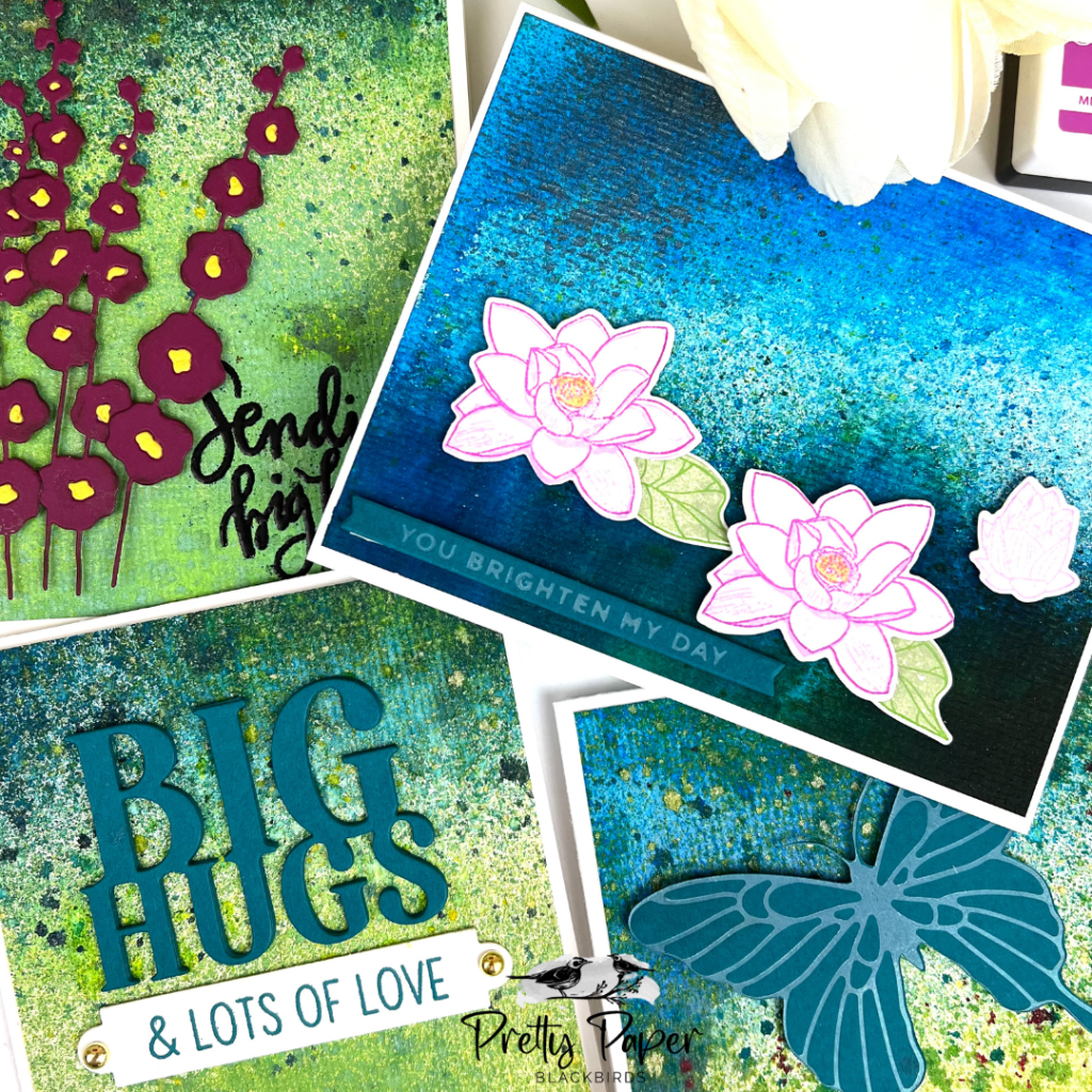
For the lotus flowers I used the Altenew Lotus stamp and die set. The stamps are layering stamps, which worked well for the pale flower effect I was going for. I stamped the outline of the flowers/buds in Gina K Designs Light Orchid Pigment Ink and then filled in the flower with a RV00 Copic Marker. I then stamped the other outline stamp in Gina K’s Medium Orchid ink. I stamped the leaves with Distress Oxides; Bundled Sage for the base color and Mowed Lawn for the detail stamp. I adhered the leaves with glue and used foam squares to pop up the lotus flowers and bud.
For the sentiment I used one of my favorite sentiment foiling sets, the Altenew Mini Everyday Sentiments. I foiled with Spellbinders Glimmer foil in Moondust on the Adriatic cardstock. I adhered the sentiment strip with 1/4″ foam tape. I absolutely loved this card and I’m saving it for just the right person and time to send.
For the flower field panel I wanted to create a light green field in the foreground. I used Mowed Lawn Distress Oxide Spray in layers, using a light misting of water to ensure the ink moved around sufficiently to cover the area. I dried this area then started on my sky/clouds. I applied Salty Ocean to the top of the panel and down the left side just a bit. I misted with water and turned the panel side to side as I dried this area. This allowed the ink to flow to create some “clouds.” I lightly sprayed some Uncharted Mariner and water over this area to create depth. After drying I misted this area with Harvest Moon to create sunshine and a bit of green to represent a tree canopy.
For the flowers I used my Lumberjack Plaid re-inker. I first splattered undiluted ink over the grassy area, then added some water to the ink to create a more watery solution that would result in larger splatter. I allowed this area to dry for a few minutes then misted the area with water to get the red ink to spread slightly. I love how this one turned out.
I liked the meadow look for this card and wanted to use a butterfly die cut for the panel. I found a butterfly foiling set from Globeland in my stash. I foiled the butterfly with the same Glimmer Moondust hot foil on the Adriatic cardstock. I recreated the same “You Brighten My Day” sentiment from the lotus card, popped both up on foam tape/foam squares and this card was complete.
For the other two cards I tried to recreate the meadow look (as I said, no two are ever alike.) For the first card I used the Hollyhocks die set. It was the first time using this die set and I was blown away by these dies. They cut beautifully and the inset area at the center of the flowers is quite nice when you use an opposite color. I cut the flowers from the Azalea cardstock and the center inset from the Mustard cardstock. Tip: Die cut the color you are using for the inset pieces upside down, or one stem at a time. This will help to contain and identify those tiny pieces when it is time to start glueing them into the flowers.
After assembling the flowers I lightly inked around the edges of the flowers with Distress Ink in Walnut Stain. This helped to give some dimension to the flowers.
For the greeting I used the Sending Big Hugs stamp from the Simon Says Stamp! Big Scripty Greetings stamp set. Unfortunately SSS does not make a die for this set (I check obsessively) so I stamped the greeting onto the panel using VersaFine Clair ink in Nocturne. I stamped it multiple times (I think 7!) because of the texture of the watercolor paper and the fact that it had multiple layers of ink on top. Ultimately I ended up applying embossing ink and embossing the greeting with black embossing powder. This was tricky because of all the ink on the panel. I had to do A LOT of clean up with my little utility paintbrush to remove the stray embossing powder in spite of using my anti-static powder tool. Be forewarned if you choose to do this!
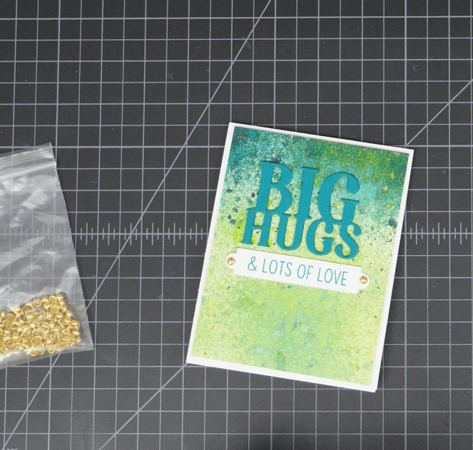
For the final Big Hugs card I choose another meadow background and I cut the greeting from the Adriatic cardstock (3 times for layering.) For the sentiment strip I chose & Lots of Love and stamped the sentiment on white cardstock with Salty Ocean Distress Ink. I cut the sentiment using the marquee-shaped die from the Spellbinders Sentiment Labels dies. This die has a hole at each end of the strip and I wanted to use some brass brads to attach the strip to my front panel under the greeting. I love how this turned out! Simple but effective.
I hope you are enjoying the videos and blog posts! I love experimenting with all my crafty supplies and especially enjoy sharing ideas for cardmaking. Thanks for reading this post!
Whether your cardmaking jam is simple or complex or anywhere in between there are some time-honored guidelines in design that will quickly take your cardmaking from good to great. Let’s dive in.
Rule of Thirds:
Think of your card front as a panel consisting of nine squares in a grid.
At each intersection of a horizontal and vertical line there is a point, four points total. These are focal points that the eye is naturally drawn to when looking at an image, top left to bottom left then top right to bottom right. Anything you place at or near these focal points will be more noticeable, anything placed away from these focal points will less noticeable. Let’s look at this card design from my last blog post and video:
My flower layout is a top left/bottom left – top right/bottom right layout and my focal points (large flowers, flower bud, sentiment strip) are all positioned at the intersection of the horizontal and vertical lines.
White Space:
This brings me to white space, another design element that I consider with each card. A sentiment or greeting against a busy background must have some space in order to stand out. A shadow layer, some vellum, stamping or embossing on a white background, leaving a perimeter – these techniques all help to draw the viewer’s eye to the message you are trying to convey with the card. Here is an example:
This is a very busy card front, but my sentiment is stamped top right (eyes are drawn here) and it is set off against the lighter blue inking of the sky with lots of space all around.
Golden Ratio:
This one is mathy-fun. It is the 1:1.618 principal and it is found throughout nature so we, as humans are already very used to seeing it all around us, even if our conscious minds don’t pick up on it. You may have heard it referred to as the Fibonacci sequence and it looks like this:
The relationship between these two shapes is the Golden Ratio. Have you seen this basic card layout before…like, everywhere? Sometimes we create layouts using this principal without even knowing it because, as designers we often create layouts based on instinct (does this look right? It needs something…. or, YES! That’s it.) My Rose card above follows this principal and I wasn’t even trying. Your instinct for a great card design might be fueled by the perfection of nature! And you can carry this rule out further in a card. Just keep applying the rule to the smaller rectangle, thereby creating smaller rectangles until your design is complete. This also applies to circles, and any other shape. (Admittedly it could get a little complicated with complex polygons and I probably won’t go there.)
Hierarchy:
Okay, let’s talk size. Larger elements grab your attention. For this butterfly card I wanted the butterfly to be the focal point of the card. I intentionally made it the largest element on the card and placed it at the center of the card, at all four intersection points. Did your eyes follow the “butterfly – Hello greeting – sentiment strip – embellishments path? That’s all about size.
Design is really exciting, don’t you agree? And we haven’t even covered color! Topic for another day (blog post.) Thanks for joining me on this design journey. Happy cardmaking!
A2 Card bases: Hero Arts in Palm, and assorted white card bases
Waterdroplet embellishments
Black sequin embellishments
Okay, it’s a thing. I make A LOT of cards for my videos. Today I have four friendship-themed cards using some of my favorite vellum techniques. The video was so long (almost an hour) that I had to delete one of the cards, so BONUS! You can only find the details for that card here on my blog.
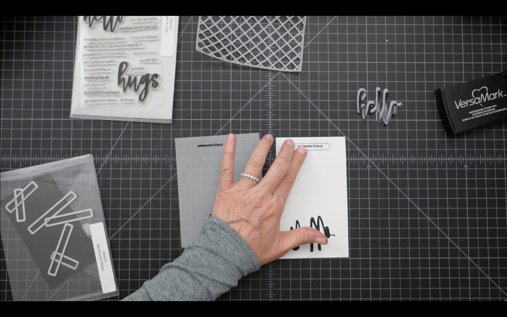
Vellum is so versatile and brings a beautiful, light touch to cardmaking. Its transparency works really well with inks of all kinds, particularly alcohol inks and distress sprays. How gorgeous are those purple Distress Spray flowers in the Hello, Awesome Friend card? And a tricky part of vellum (the curling) was a huge plus for these layered flowers. Okay, on to the making:
Start by cutting seven A2-size panels from the vellum of your choice. You’ll need at least one panel for each of the cards.
Card #1 – Purple Flowers
I started by inking two vellum panels in my spray box; one for the leaves and one for the purple layered flowers. For the leaves I used a Distress Spray Stain in Forest Moss for the first layer. I sprayed the stain and then gave the panel a quick spritz of water to help the stain move around a bit. I dried this layer with my heat tool then applied a quick spray of Distress Mica Stain in Wicked Elixir. The mica stain has a shimmer that really amps up the color. After applying a quick misting of water I dried this layer. For the final touch I applied a quick “timid spray” of Distress Spray Stain in Black Soot. (If you are unfamiliar with my timid vs all in spray technique see my Wicked Good Halloween video linked in that blog post. It’s a real thing, I promise.) Then I set that panel aside to dry.
For the flower vellum panel I followed the exact same process, only the ink colors are Picked Raspberry, Fortune Teller and Black Soot splatter accents. Dry the ink between color+water applications and set the panel aside to dry.
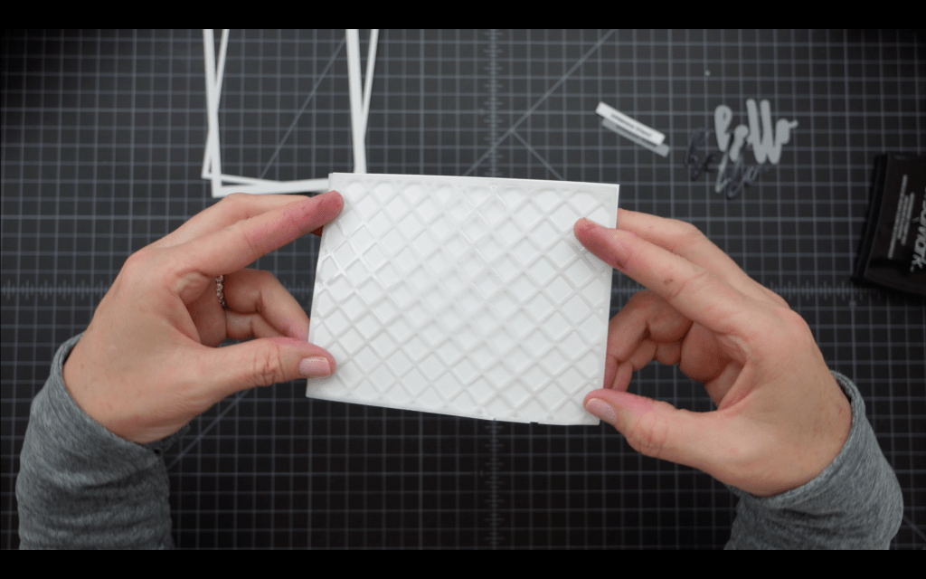
Next I taped an A2 vellum panel to the cutting side of the Garden Trellis cover die. Vellum will slide around during die cutting so tape it securely! I ran this through my die cut machine and then spent a few minutes cleaning up all those little diamond die cut scraps….
For the greeting I stamped the large “hello” greeting stamp onto a scrap of white cardstock using Versamark embossing ink, then applied Midnight Black embossing powder. I heat-set the powder then used the coordinating shadow die to cut a shadow layer from vellum. For the sentiment strip I stamped the “awesome friend” stamp on scrap white cardstock with embossing ink and heat embossed with the same Midnight Black embossing powder. I used a sentiment strip die from the Gina K Designs sentiment strips set to die cut the sentiment and an additional strip so I could layer the two. I used the die that was just slightly narrower than the greeting for some balance.
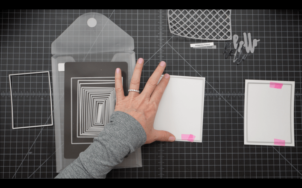
Next I used the A2 Layers Dies to cut two frames for my front panel. I used the second and third largest dies and centered them on white A2 size cardstock panels. I cut two sets as the Rose card also uses these frames and it is a huge time saver to die cut in bulk.
I wanted to create some contrast on the vellum trellis piece so I used a sponge dabber that I have earmarked for this purpose to apply embossing powder to random places on the trellis. I applied White Pearl embossing powder and heat set. This adds a little pop of shine that helps to break up all the flat white on the background.
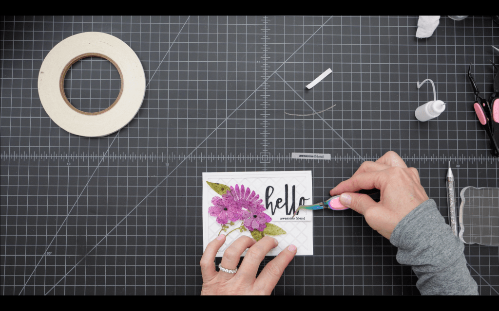
At this point my two color panels were dry so I moved on to die cutting for the flowers and leaves. I did not use a specific die set for this process. I have an assortment of layered flower, leaf and stem dies that I keep in the same stamp and die envelope. Some are from Amazon, some are Sizzix. I used some layered flowers, stems and leaves that looked good together and fit the size of my front panel. It was fun to find different spaces on the inked panels that produced nice layers and contrast for the flowers and leaves. Once this die cutting was complete I was ready to assemble the card. I wanted the trellis panel to be free floating in the center of the panel so I adhered the frames to this panel first by placing adhesive only around the perimeter of the frames. I then adhered this completed panel to the front of the card using adhesive only on the perimeter of the panel. This allows the trellis layer to pop up a bit and creates a bit of a shadow that adds dimension to the card. Since the vellum flowers and leaves are inked with darker colors I could used liquid adhesive to adhere them to the card front on the left. I applied some black embellishments to the centers of the flowers to give some depth. I adhered the greeting to the vellum shadow layer and then adhered that to the card front on the top right, with the sentiment strip popped up on foam tape and applied below the greeting just slightly overlapping the bottom of the “ls” in Hello.
I applied some water droplet embellishments just below the sentiment in a diamond shape, and the card was complete.
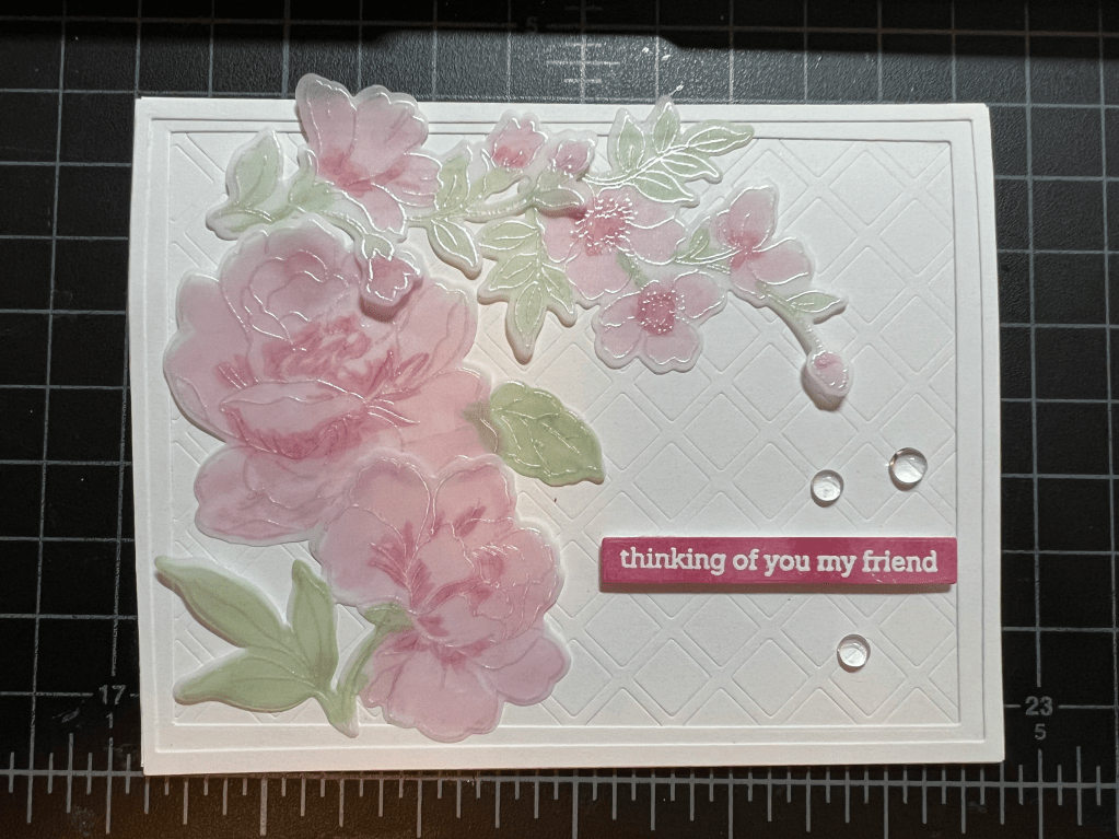
Card #2 – Roses
For this card I was going for a softer, more transparent look for the flowers. I chose some flower stamps from the Altenew Flower Garden Stamp and Die set and stamped those in my Misti onto one of the vellum panels using Versamark embossing ink. I applied White Pearl embossing powder and then heat set the powder. These are outline stamps and they worked perfectly for this technique. I used the coordinating dies to die cut the flowers and leaves. For the Copic coloring I wanted to stay with the soft, transparent look so I chose lighter colors; a pale pink and a slightly darker shade for the flowers and a pale green for the leaves. I applied the alcohol marker to the back side of the vellum panel (the non-embossed side) using the darker shade of pink (actually red) to shade the center of the roses and base of the petals.
I used the coordinating dies to die cut the images – This set comes with so many flowers and dies in an array of sizes.
For this card I wanted an embossed trellis panel so adhered the cover die to a white A2 cardstock panel and ran this through my die cut machine using an embossing sandwich. For my Platinum 6 this consists of the platform on the bottom, die and cardstock on top of this, flexible embossing mat next and the embossing plate on the top. Your stack might be different depending on your machine, cardstock, etc.
I wanted to coordinate the cardstock color for the sentiment strip with a color I was already using on the front of the card so I inked up a scrap of white cardstock with the R85 comic marker and used that for cardstock. I stamped the “thinking of you my friend” sentiment with embossing ink, applied a white detail embossing powder, then heat set. I used only a sentiment on this card and I love all the white space and open feel.
To assemble the card I first applied the two frames I cut earlier to the trellis panel using liquid adhesive. I then arranged the vellum roses on the front, going with a draping effect from bottom left up and over the top. I attached the roses with double sided tape, taking care to apply the tape to the back of the roses in areas where the inking was a little darker or where the flowers overlapped. I attached the sentiment strip with foam tape and added a few water droplet embellishments. This card was quick and easy will be perfect to pull out when I just want to send a little hello to a friend.
Card #3 – Butterflies
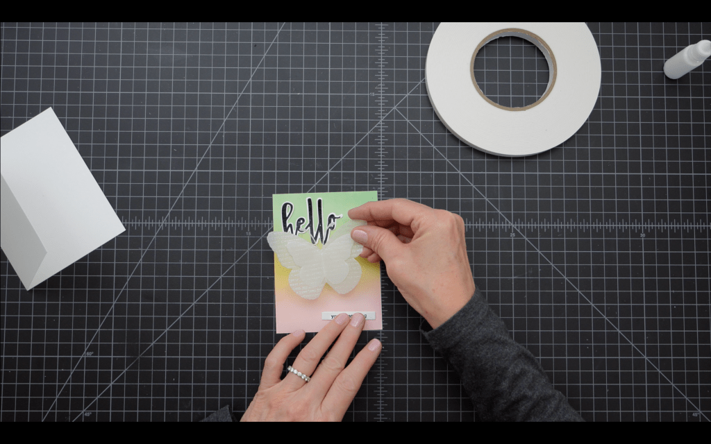
For this card I wanted a soft, ink-blended front panel with spring colors. I chose Distress Oxide inks in Tattered Rose, Scattered Straw and Evergreen Bough and I applied with a light hand, taking care to blend the colors smoothly in the transition areas.
For the greeting and sentiment I chose the Hello and You Are Amazing stamps from the Hello and Hugs set (Yes, I fell in love with this set for this project. It will definitely be in my cardmaking rotation for the near future.) I heat embossed the greeting in Midnight Black embossing powder and for the shadow layer I just used white heavy cardstock. I stamped the sentiment strip in Versafine Clair Nocturne and can I say that the soft, ink blended colors are really set off by the black text on this card. Love.
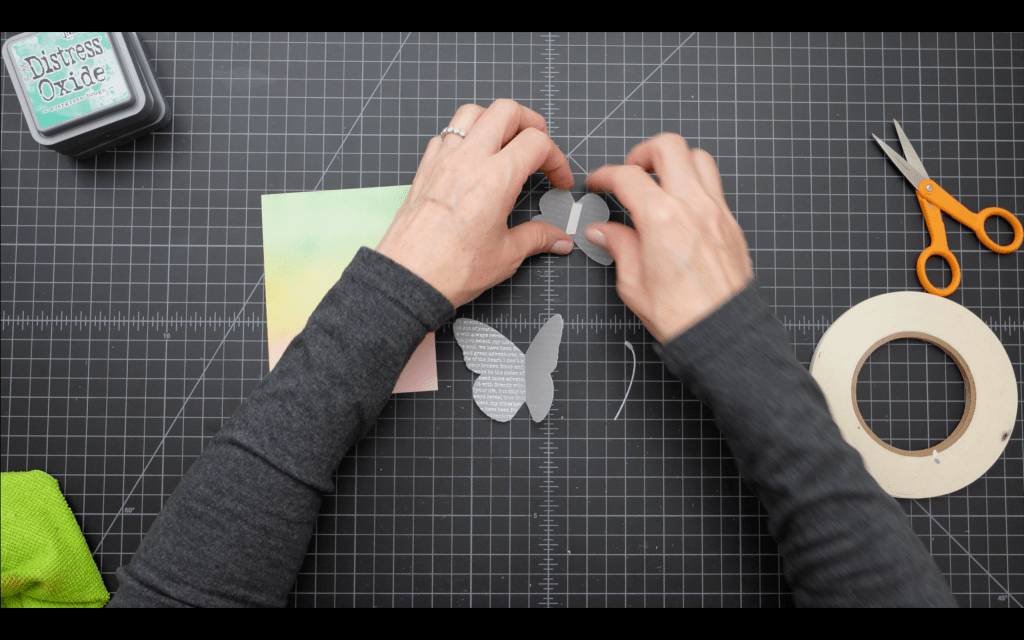
For the butterflies I used the Friendship Text background stamp on vellum – I created two panels, inking these with embossing ink and heat embossing with White Pearl embossing powder. I used the second and third largest butterflies dies in the Hero Arts Butterflies Infinity Dies set to cut two butterflies (and antennae) for layering. I applied Distress Oxide ink in Wilted Violet very lightly to the outline of the butterflies just to add some contrast. This step is not in the video! I am a serial card alterer. I also folded the butterflies along the center to give them some dimension when they are layered.
To assemble the card I applied double sided tape to the backs of each butterfly only along that center fold. This will help to hide the adhesive on the finished card. I layered the smaller butterfly on top of the larger butterfly and then used the exposed adhesive on the back of the larger butterfly to adhere the antenna.
To assemble the card I adhered the butterflies to the center of the inked panel and then spaced the greeting above to the left and the sentiment strip below to the right using liquid adhesive. I added three water drop embellishments in a triangle shape on the bottom left and then adhered this panel to the front of an A2 white card base. I added some Glossy Accents to the tips of the antenna and the card was complete.
Vellum is so versatile and these are only a few of the ways I’ve been using it lately in my cardmaking. I’m working on one more blog post for an additional card that didn’t make it into this YouTube video. I’m trying to keep those below 30 minutes and I’m also working on some shorts for YouTube that will be coming next week.
The Carnival mask is an SVG file from Etsy, loaded to Cricut
Hero Arts Cheeky Birthday Stamp Set
Pretty Pink Posh Birthday Sentiment Stamps and Dies
Gina K Designs Fizzy Stencil
Altenew Gerbera Revolution Stamp Set
Altenew Watercolor Coloring Book
Spellbinders Stacked Decorative Edges Die Set
Waffleflower Birthday Kitties Combo
Sizzix Nesting Scalloped Circles
Gina K Designs Master Layouts 2
The Stamp Market Heart & Hugs Die Set
Altenew Wavy Outlines Die Set
Wow! White Pearl Superfine Embossing Powder
Ranger Glossy Accents
Versafine Clair Pigment Ink – Nocturne
Altenew Mixed Media Ink – Grapevine
Wow, so many cards! Again, I went a little crazy with the cardmaking for this post/video. You can check out the 30 minute video HERE on YouTube for more detail.
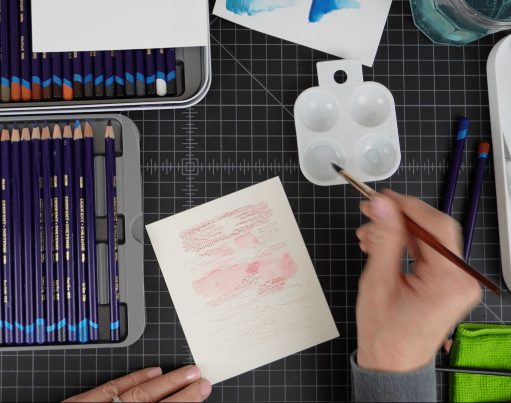
I’ve been working with Inktense products for a few months now in my painting and cardmaking. The colors are so vibrant and intense, it is really exciting to see the pieces come to life when you add water! Just a bit of background on Inktense. It is a wax-based product, like colored pencils, but the formulation allows the ink to react with water to “activate” much like a watercolor product. Once the product is wet it will dry to a “permanent” state. That is in quotes because I, and other artists/YouTubers have definitely shown that you can sometimes move the product after it is dry. More on that in the next post…
What I really love about Inktense is the ability to use the product in so many different types of applications because the color stays true between products AND the products behave differently depending upon the technique you are using, the paper you use, etc. So I’ve been able to switch between products using the same color without any issues with color matching. Brilliant!
Here’s how I used these Inktense products in the cards.
I used both the 510 Cherry pencil and paint to create watercolor backgrounds for two of the cards. I used watercolor paper for both of the cards. With the pencil, I laid down a light layer of ink directly on the paper, then went back over some areas of the paper to apply more ink/more pressure on the pencil. This results in deeper areas of color once the ink is activated with water. I then used clean water and a size 8 round watercolor brush to activate the ink. This is a great method to get a nice watercolor background for cards, but I much prefer the next method!
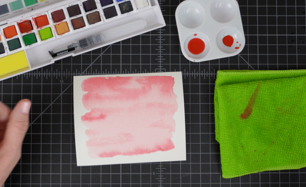
For my second panel I used the paint pans, again using Cherry ink. For this panel I mixed two different saturations of ink in my palette, one a light wash and the other a deeper more pigmented color. I started by laying down the lighter wash with a large brush and WHILE THE PAPER WAS STILL WET (VERY IMPORTANT, HENCE THE CAPS!) I went back in with the darker color and laid down some ink in a few areas to create some shadows and areas of interest.
With the two panels I created the Hugs card and the XOXO card.
Hugs Card:
This card was super quick and I love the craft cardstock/red cardstock combo. I trimmed the watercolor panel down to 4 x 5 1/4″ and glued that panel to a 4 1/8″ x 5 3/8″ Cranberry cardstock panel. The two overlapping hearts are from The Stamp Market’s Heart and Hugs die set. I’ve just started shopping The Stamp Market and I am really impressed with their products. Let’s just say I now have many more possibilities for Valentine’s Day/Anniversary cards. I die cut two hearts and two hugs die cuts from the same Cranberry cardstock. I ran the hugs die back through my Gemini Jr on Sand cardstock and that is literally all the pieces you will need to make this card. I LOVE simple and cute cards. I can get as overblown as the next person with my cardmaking and sometimes it is just really nice to keep it CAS, right? So, to assemble the card I slightly overlapped the heart die cuts (see photo above) and then used a combo of glue and tiny snips of foam squares to adhere the hugs die cut (stacked and glued together with the sand cardstock on the bottom to create a slight shadow) overlapping the heart on the right.
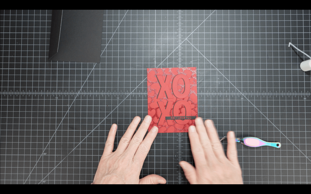
XOXO Card:
Another sweet and simple card, and my favorite of this series. I used the larger stitched rectangle frame from Gina K Designs Master Layouts 2 to create a stitched border on my watercolor panel. I had some die cuts from Altenew’s Wavy Outlines die set. I had die cut them on layering weight white cardstock. So I stacked two of each die cut together and used the single rose and the rose with two leaves to create a floral image on the front of the card. It looks so sweet against the pink watercolor background. For the greeting I die cut the XOXO die from The Stamp Market’s Heart and Hugs die set. I cut this from another pink watercolor panel I made as a “test” panel when testing out the paint pans. I always save those panels, I never know when I will need just a scrap of something! So, after stacking two XOXO die cuts I heat embossed this greeting with Wow! White Pearl Superfine Embossing Powder. I love love love this embossing powder. The pearlescence really complimented the softness of this card.
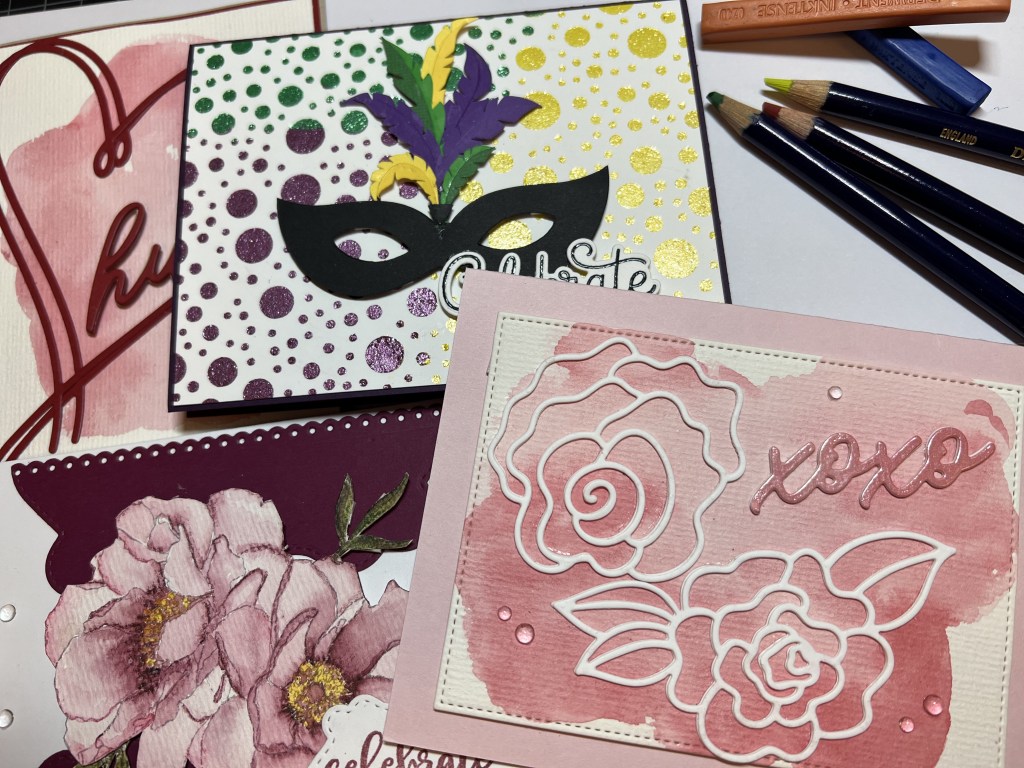
Mardi Gras/Carnival Mask card:
My son and husband both ride in parades at Mardi Gras so I’ve been a frequent visitor to New Orleans during Mardi Gras. It’s such a fun time and the friend group we travel with make for a very lively party. It is that time of year so my thoughts naturally turned to the purple/yellow/green color scheme of Mardi Gras. For this card I wanted to use the Gina K Designs Fizzy stencil because it looks like a party! I don’t keep a lot of pastes on hand because I don’t use them enough to warrant the risk of $$$$ versus dried up paste. However I have discovered a way to keep a few colors/types of pastes on hand and then tint those pastes to my desired color. I did not invent this method, I saw another cardmaker do this in a video, I think it was Marian Emberson but I honestly can’t remember. Regardless, here is the method:
METHOD: Choose an Inktense block (or blocks) for your paste color. Using a craft knife or a mini grater, finely shave or grate a small amount of the block onto a cutting board or silicone surface.
You want to use a white surface so you can see if the color is correct and your ink has completely blended. Estimate the amount of paste you will need for your project and place that paste on your surface. Using a craft spatula mix the ink and paste thoroughly. I find that folding and pressing firmly into the paste helps to blend the mixture quickly and thoroughly. You’ll want to work quickly as the paste will start to thicken. This stuff starts to dry quickly. Note: If you are blending two colors of blocks you might swatch the blended color on some watercolor paper before mixing it into your paste. You can then use the tinted paste on your project. Needless to say I have several jars of Nuvo Glacier Paste in Winter White and I’m not at all concerned that it will be wasted.
For the front panel I used the Fizzy stencil to add three different colors of paste that I created using the method above. I let each color dry before applying the next color because I’m careful that way but I suppose you could leave the stencil in place and then mix up the next two colors and apply all in one go. My method prevented the paste colors from mixing while wet but mixing at the borders might be a good look? For the mask cut out I had to go to the interwebby to find an SVG file that I liked. This one is from SVGVectorMonster. I paid my $1.99 and downloaded the file to my Cricut. I used a combo of purple, green and yellow cardstock for the feathers on the mask and the mask is a heavyweight black cardstock. I assembled the mask with glue then used foam squares to pop it up on the Fizzy panel. The greeting is from Pretty Pink Posh’s Birthday Sentiment Stamps & Dies. I stamped this on heavy white cardstock using Versafine Clair Nocturne ink, then stamped once more with clear embossing ink and heat embossed with clear embossing powder. I used a combo of glue and tiny foam squares to adhere the greeting at the bottom right on the mask, slightly overlapping. The Fizzy panel is cut 1/8″ smaller than the A2 card base so 1/16″ of the Eggplant base shows on all sides of the front panel. I created a white inside panel for the card that is 4″ x 5 1/4″. I used the confetti and streamers stamps from the Hero Arts Cheeky Birthday stamp set to stamp some fun party images using Stampin’ Up! ink in Gorgeous Grape, Daffodil Delight and Garden Green. This is such a festive card, I love the vibe!
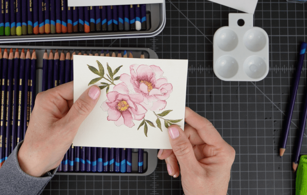
Peony Card:
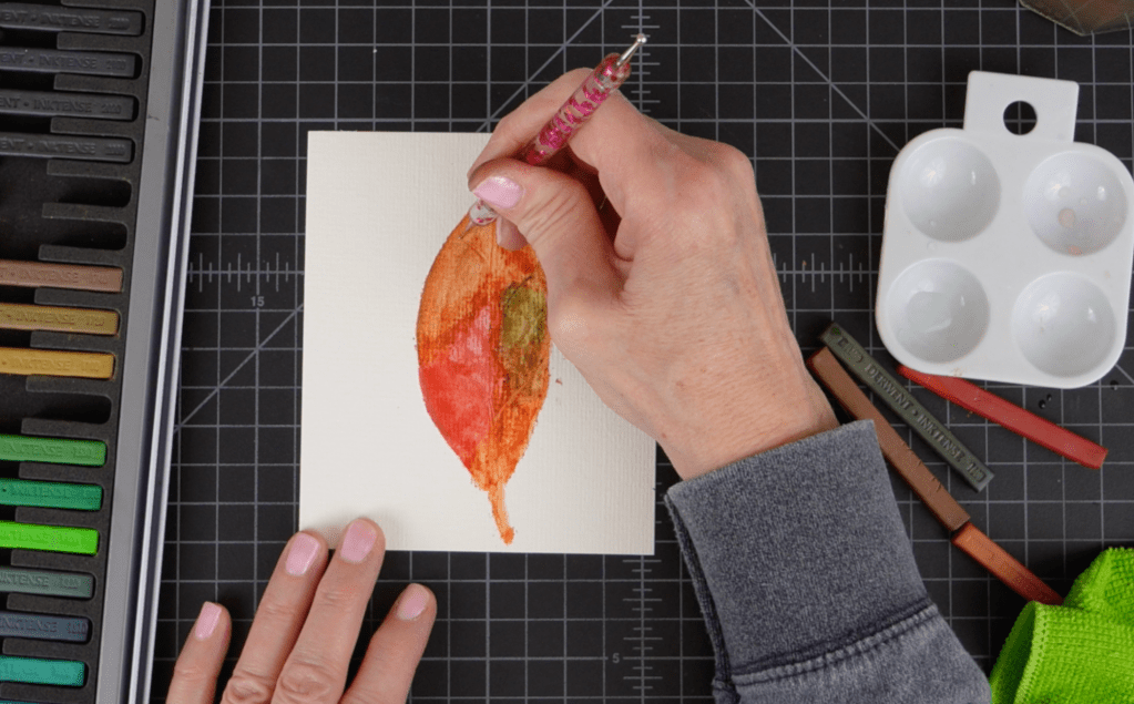
The 4th card is a floral watercolor-like card using an image from Altenew’s Watercolor Coloring Book. I used 220 Sicilian Yellow and 600 Shiraz Inktense pencils to color the flower. These pencils have such an amazing gradient of color it is totally possible to get this depth using only two colors.
The leaves were colored using 1550 Spring Green, 1600 Leaf Green and 1730 Oak. I layered the colors then used a very small #2 watercolor brush to activate the ink, taking care not to overblend the colors. I didn’t have a die for this (boo) so I had to fussy cut (another boo) but I have a trick to make your fussy cutting look so much better! After fussy cutting use a damp finger to go around the edges of the image to smooth out any rough places where your cutting wasn’t exactly smooth. Then take a colored pencil or copic marker, whatever you have in a light coordinating color and go around the edges of the image on the edge of the paper. This takes away any glaring white spots that maybe weren’t cut perfectly. You’ll be amazed at how much better your fussy cutting looks!
For the background image I used a die set that I received from my son for Christmas. I think this was from Amazon. It has loads of nesting frame dies. I used one of the larger dies to cut a frame for my flowers (I think these are peonies, not sure.) After playing around with the placement on the card front I ultimately decided to cut the frame in half and I used a border die from the Spellbinders Stacked Decorative Edges die set to create a pretty edge on each piece. I switched them around on the card front to create a vase-like look and then adhered my flower image with foam squares in the center of the die cut “vase.” For the greeting I stamped the “Celebrate” and “Your Big Day” stamps on white cardstock with Altenew Grapevine Mixed Media ink. I stamped these separately so I could get the spacing just right. I die cut the greeting with a small matching die from the ornate frame die set. The greeting was adhered with tiny foam squares and small amount of glue where the greeting overlaps the flowers. At the last minute I added some water drop embellishments for a bit more interest. I think this would be a beautiful card for Mother’s Day or a birthday.
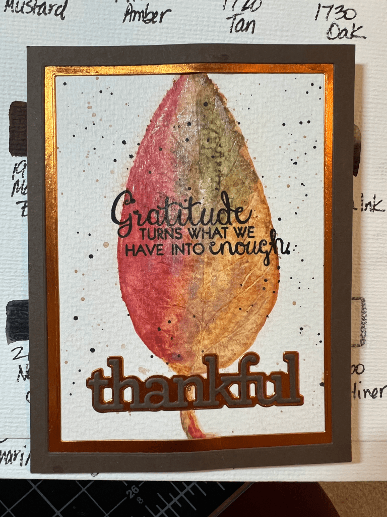
Leaf Card:
In my YouTube video I show how I created the leaf panel but I didn’t video the assembly process. Here is the card:
For the panel I used Inktense blocks in 500 Chili Red, 1600 Leaf Green, 1800 Baked Earth and 1900 Willow to freehand sketch the leaf shape. I applied the block color directly to watercolor paper, slightly overlapping some of the colors for added depth and some blending.
These blocks feel and act much like pastels but they are very water reactive and “permanent” when dry.
I then went back over the drawing with a wet watercolor brush, taking care to clean my brush between colors unless I wanted more blending. I added additional layers of ink and activated with water until I had an image that I liked. Before the image dried I used a ball stylus to create vein shapes in the leaf by pressing the stylus into the ink and using it much like a pencil to “draw” the veins.
After the panel was dry I trimmed it down to 4 1/4″ x 5 1/2″ and then used a dark shade of 1740 Saddle Brown and 2020 Indian Ink mixed with a tiny bit of water and created splatters on the panel. For some added interest I applied a tiny amount of Inka Gold in oldsilver using just my finger and a paper towel for buffing. For a greeting I used both die cuts and a stamp. For the die cuts I used CZ Design’s Thankful 1 greeting and shadow die set. I cut the greeting from Hero Arts’ Chestnut cardstock and the shadow layer from Recollections copper metallic cardstock. The greeting stamp is from Colorado Craft Company’s Gratitude Slimline stamp set. I love really large greetings that take up some real estate on the front of a card. I used these same cardstock colors to cut the rectangle frames for the image using Waffle Flowers’ A2 Layers Dies. This is a great card for Thanksgiving/fall and I’ll probably make a video later this year on the whole process.
I have one more Inktense video coming up this week and this one is all about paper choices and how Inktense products perform on different types of paper. I hope you’ll tune in on YouTube to check out the video. Please subscribe to my channel so you will get a notification when I post a new video!
Hero Arts Hero Hues Premium Cardstock – Pitch Black & Cranberry
Erin Lee Creative – Glossy Black Cardstock
Confetti/Shaker Filler
Are you ready for some quick and fun Valentine’s cards? I’m taking a break from snowflakes and hot cocoa cards to focus on hearts and love. I have FIVE Valentine’s cards to show you and these were not only quick to assemble they feature awesome color combos. And I kept the color choices very simple…I used only two cardstock colors for each series and the cardstock can be substituted from many crafting suppliers! And starting with this post I am including screenshots from my videos for more detail. Of course, you can always pop over to YouTube to check out the videos in their entirety!
This card was the most time-intensive card but still only took about 20 minutes start-to-finish. I’m not kidding when I say these cards were quick!
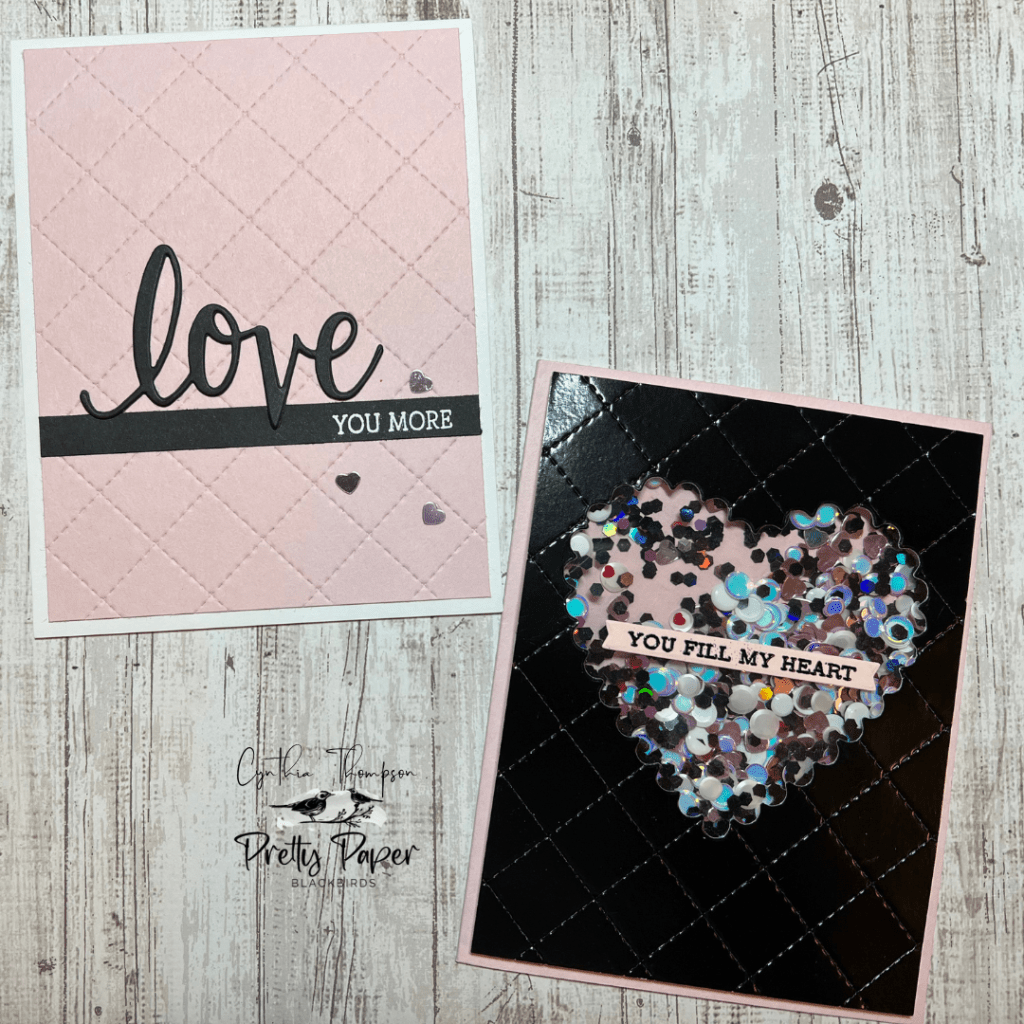
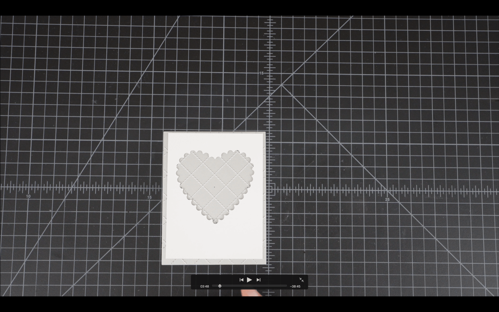
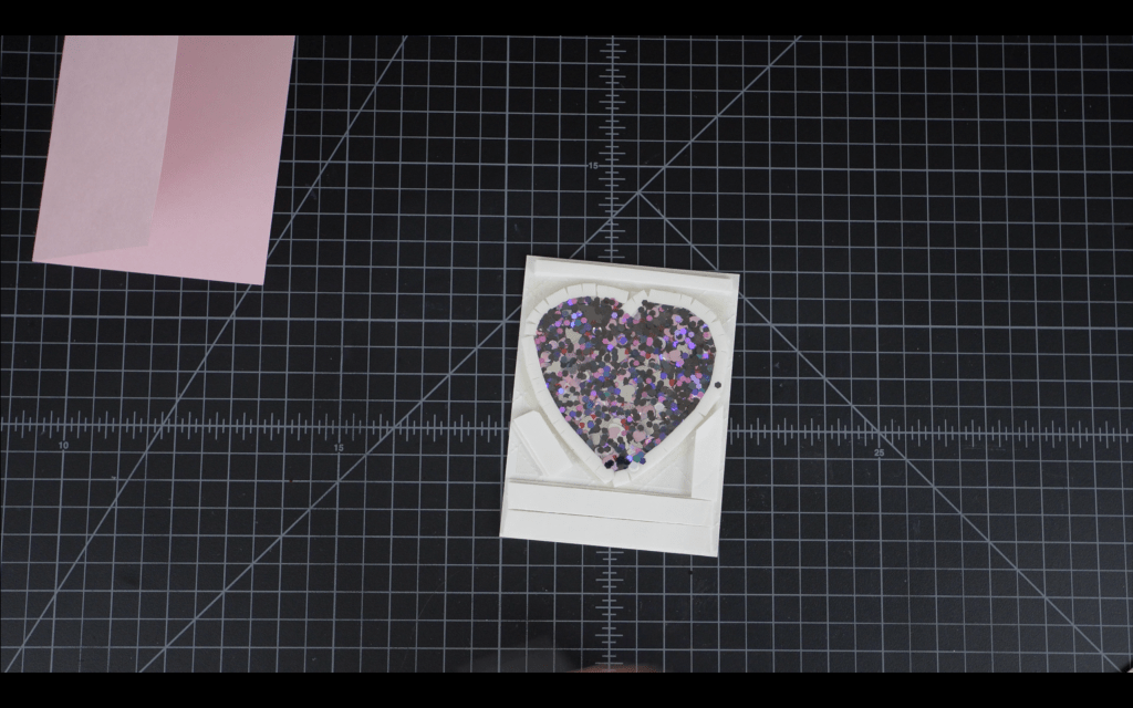
I started by creating the die-cut front panel shaker window. I always die cut before I emboss in order to preserve the depth and detail of the embossing. So I ran a 4″ x 5 1/4″ shiny black cardstock panel and a heart die through my die cut machine to create the front window. I’ll save this die cut for an upcoming card in this series! Next I lined up this window panel on the quilted card front die and ran this back through my die cut machine to create the quilting on the panel. I always place the embossing die face up and the front of the card panel face down over the die.
Next I used SKOR tape to adhere an acetate piece on the back of the panel over the die cut opening. I can then build the walls for my shaker. I used 1/4″ foam tape, two layers for the walls. I always snip one edge of the tape to facilitate applying the tape around curved edges.
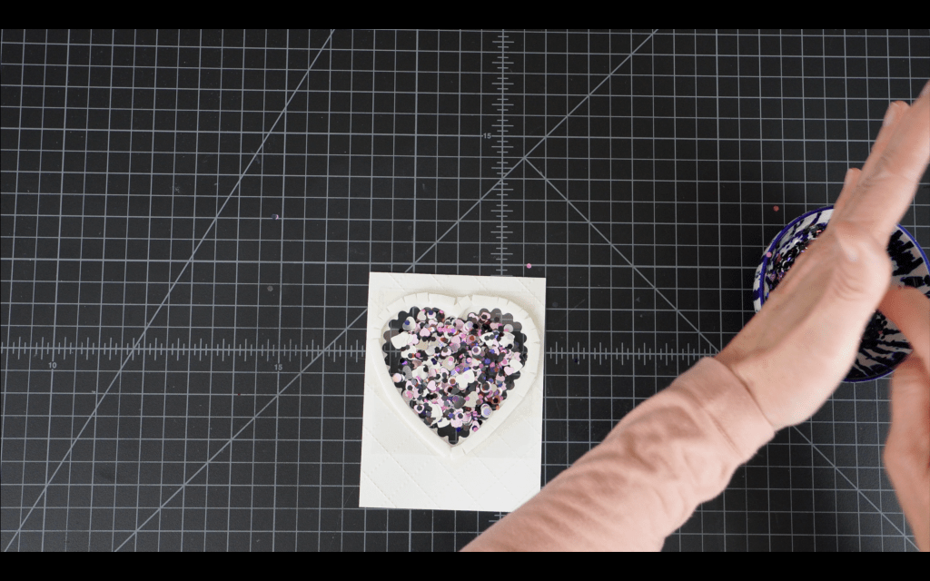
After applying two layers of tape I removed the tape and added my shaker elements. I like to create my own shaker mix. For this card I used some metallic pink hearts, tiny black hexagon sequins, pink hexagon sequins and holographic silver sequins. I love this mix against the black and pink foundation of the card.
I like to apply an acetate backing to the shaker area, so I cut a small panel, removed the backing tape from the foam tape and adhered the panel. The shaker bits always want to jump up and stick to the acetate so be sure to apply some anti-static powder before you complete this step!
Next I trimmed the acetate backing and then applied the rest of the foam tape to the back of the panel, taking card to apply two layers to match the depth of the foam tape on the shaker walls.
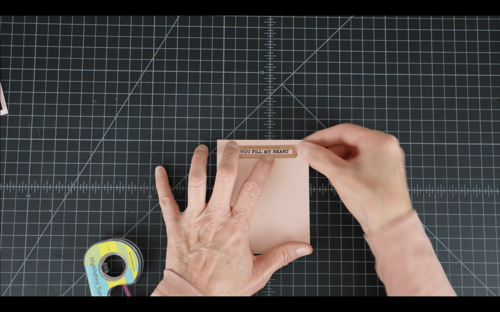
Next I removed the tape backing and adhered this shaker panel to my A2 Peony card base. The final step was to create a sentiment strip for the card. I used the “You Fill My Heart” sentiment from the Altenew Sentiment Strips 3 stamp set. I heat embossed the sentiment on Peony cardstock with shiny black embossing powder, then die cut the strip with the included banner die.
To complete the assembly of this card I adhered the sentiment strip to the shaker window with SKOR tape.
Quilted Love Card
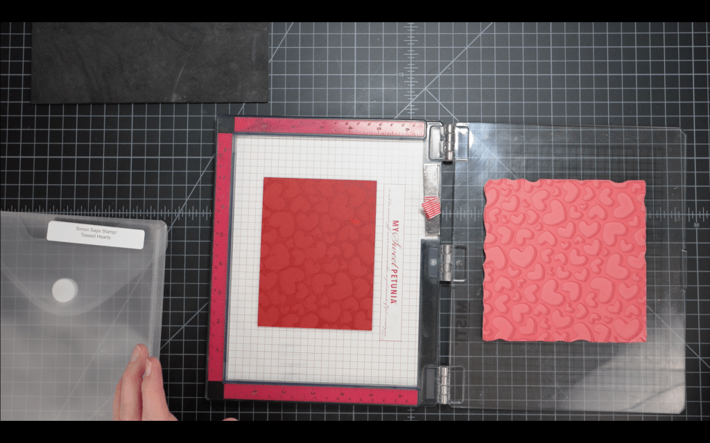
This card was so simple and quick to make but was easily one of my favorites from the series. I started with an A2 white card base (I always use at least a 100# cardstock for my card bases.) I trimmed a Peony panel down to 4″ x 5 1/4″ and then ran the panel through my die cut machine with the quilted card front die. The sandwich I use for my Platinum 6 (yours will likely be different) is this stack, bottom to top: platform/die (cutting side up)/cardstock (front down)/flexible embossing mat/embossing plate.
Next I die cut the “LOVE” greeting three times from Pitch Black cardstock. I’ll stack and glue these die cuts for some dimension. I then cut a strip from black cardstock for my sentiment “You More.” The strip is approximately .5″ wide, just wide enough to stamp and emboss the sentiment. I stamped this in my Misti with VersaMark embossing ink, then applied white embossing powder. Here is the strip after heat setting the powder:
And that is it for elements for this card! On to assembly! I placed the sentiment strip just below the center of the card and glued the LOVE greeting just above the strip, with the bottom ascenders in the text just touching the strip.
I used my picker to pull out a few of the pink hearts from the confetti mix from the first card and glued a few of those to the front of the card. Card complete!
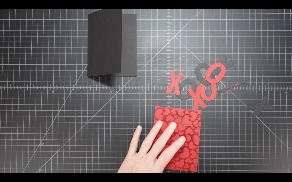
The XOXO card was my favorite of all the cards I designed for this project. I started by heat embossing the Tossed Hearts background stamp on a 4″ x 5 1/4″ cranberry panel with Versamark ink and clear embossing powder.
I set that panel aside to cool and moved on to die cutting. I used the XOXO die and both the Cranberry and Pitch Black cardstock to cut the image. I stacked the layers, red on black, to create a shadow layer. I used the Altenew hot foil sentiment plate “P.S. I LOVE YOU” to hot foil with red foil onto a small strip of Pitch Black cardstock. This set includes the sentiment strip die that is banner-cut on both ends. Beautiful, looks like an arrow!
I used my T-square ruler to line up all the die cut elements on the heat embossed front panel of my card. I applied the sentiment strip with a small strip of 1/8″ foam tape, for added stability and a little dimension.
The final step was to simply glue this panel onto the front of a Pitch Black A2 card base. I did not show this step in the video but a small red panel on the inside of the card would be great for adding a personal note.
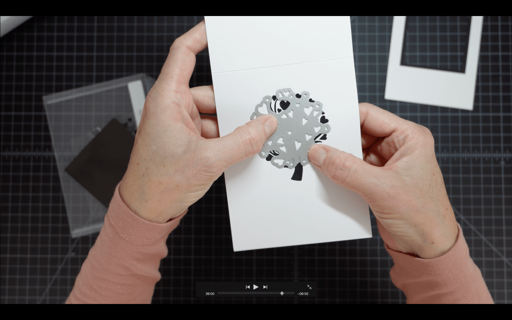
Heart Tree Card
This card was really fun to create and I love how the red heart leaves pop! To create this card I started with a Pitch Black 4 1/4″ x 5 1/2″ panel and a white A2 top fold (portrait layout) card base. I cut a 3″ square from the top center of the card base, then placed my black panel inside the card and positioned the 2 7/8″ square die inside the frame I just cut, carefully centering the die inside the previous die cut.
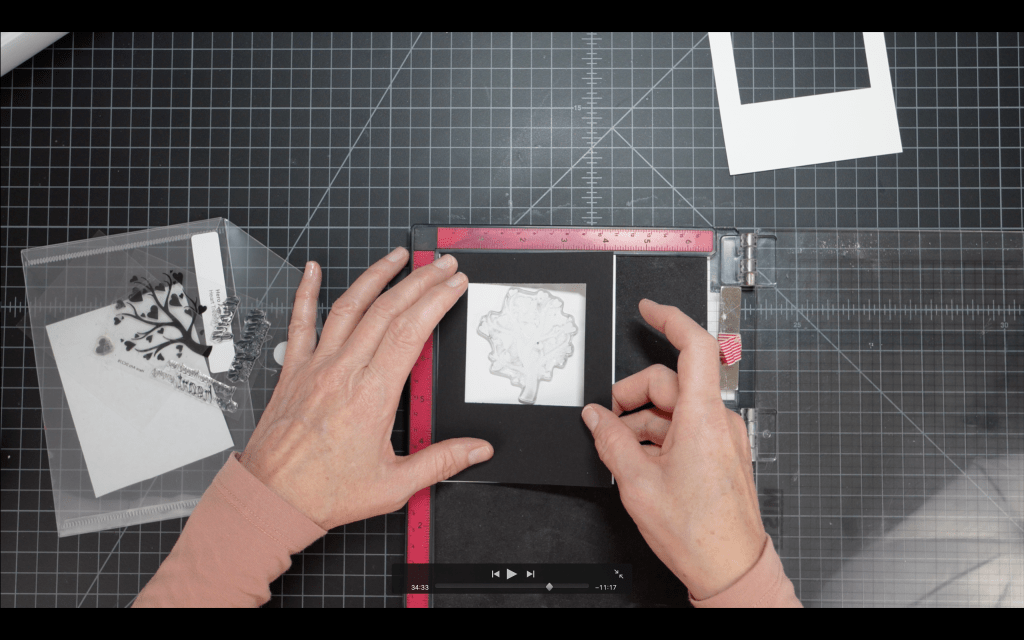
Next I started working on the stamped and die cut tree image. I placed a 4 1/4″ x 5 1/2″ white panel in my Misti. This was layering weight cardstock. I placed my die cut black panel over this white panel and then I centered the Heart Tree stamp in the opening.
I stamped the image with VersaFine Clair ink (my favorite black!) and then cleaned my stamp while the ink was drying. Next I applied VersaMark embossing ink to the stamp and stamped the image again. I applied clear embossing powder then heated up the powder. Wow, the gorgeous black ink and the shine of the clear embossing powder! This image wowed me and it was only shiny black at this point.
Next I lined up the die from the set, matching the pencil marks I made on the die with the tree trunk in my stamped image. When done correctly you should not see ANY stamping inside the heart areas on the die.
After die cutting the hearts on the stamped image I moved on to the greeting die and sentiment strip. For this card I chose to use the large “Love” die from the Hero Arts Love Stamp and Cut set and the “All You Need Is” sentiment strip from the same set. I die cut LOVE three times from the Cranberry cardstock and stacked/glued the die cuts for dimension. I positioned the Love stacked die cuts on the front of the card temporarily while I placed the sentiment stamp. I stamped the “All You Need Is” sentiment on the front panel using VersaFine Clair ink.
The final step was to assemble all the elements of the card. I glued a Cranberry panel into the inside of the card after trimming a scant 1/16″ inch from the right and bottom sides of the card – just to ensure no red shows on the edges of my card base. I then placed my black frame panel over the card base, and finally glued the white frame panel to the front of the card. The last step was to adhere the “Love” greeting. I really love the beautiful simplicity of this card!
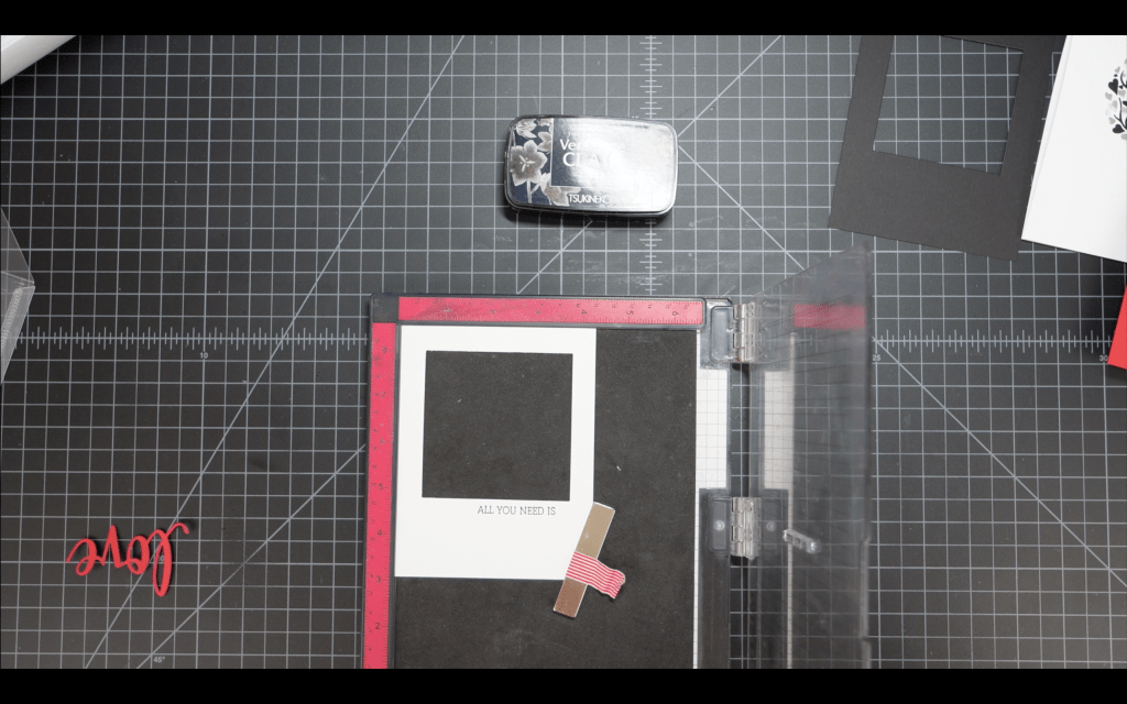
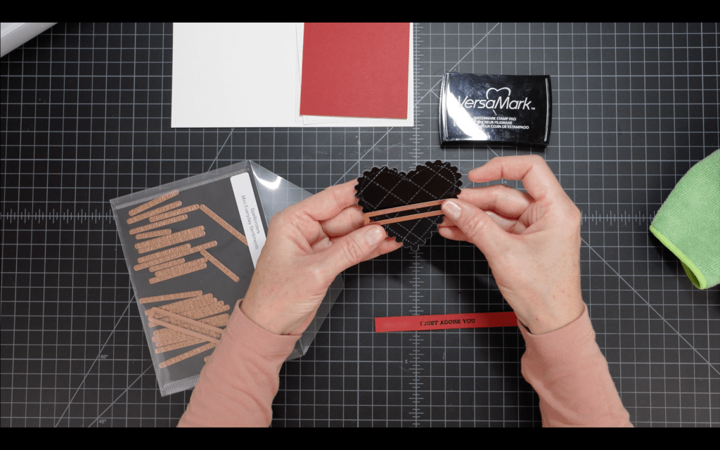
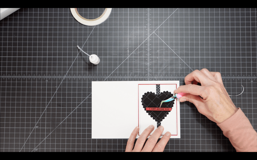
Quilted Heart Card
I used the recycled quilted black heart from the pink shaker card for this card. I started by using the Double Stitched Rectangles dies to create a stitched effect on the border of both a 3 3/4″ x 5″ white panel and also the front panel of an A2 card.
Next I created a sentiment for the card. I chose the “I Just Adore You” sentiment from the Altenew Sentiment Strips 2 stamp set and I heat embossed the sentiment on a small strip of Cranberry cardstock with shiny black embossing powder.
I then cut a 7″ length of black dotted ribbon and used SKOR tape to temporarily hold the ribbon to the back of the heart while I positioned the heart in the center of the ribbon and the center of the white panel. I folded the ends of the ribbon behind the panel and secured with more SKOR tape. Once the ribbon/heart was centered and secure I glued the sides of the heart to the panel.
The front panel assembly was quick at this point. I glued the heart panel to the red panel, being careful to keep the same margin on all sides (this was very small, 1/16″ on all sides.) I then centered and glued this panel onto the card base, again keeping the same 1/16″ margin on all sides. Finally I used a small piece of 1/8″ foam tape to adhere the sentiment to the heart die cut.
The quilting against the shiny black cardstock is really beautiful!
I am still working on Valentine’s Day cards that I’d love to share. Stay tuned!
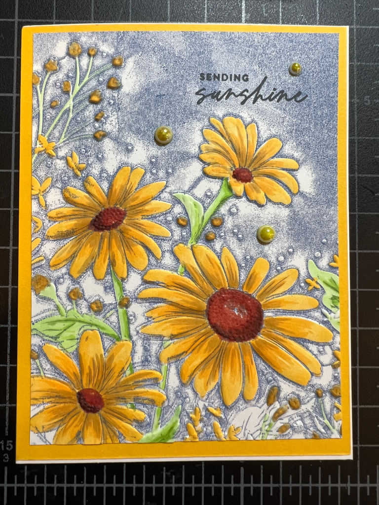
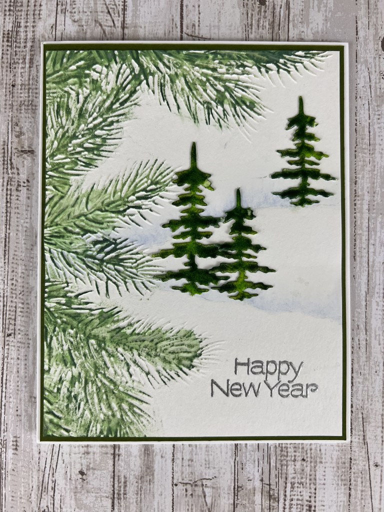
I have a few upcoming projects featuring glazed images – This is the first! I love the small, cool color palette on this card. It feels frosty! The YouTube video is here if you’d like to see more detail.
I started with the watercolor panel and lightly pencilled in two faint lines for hills, from approximately center left on the panel to the top 1/3 mark on the right and bottom 1/3 mark on the right (I refer to these as upper hill and lower hill.) I erased most of the pencil marks, leaving just enough to be able to see in order to add the watercolor. Using clean water and a #4 round watercolor brush I added a light layer of water along the top of each line, extending up approx an inch. *I created a very light wash and a darker wash of Cob Matte in my palette. I applied the lighter wash into the water line I created on the panel, allowing the color to blend with the water and start to spread up from the line. I added additional color along the lines until I had a shade that best resembled snow banks. Allow to dry. *Note: If you don’t have watercolor or don’t want to use watercolor for this step you could simply freehand some hillsides using paper templates, Distress Oxide Tumbled Glass ink and a blender brush. Apply lightly and build the color until you have a shade that you like!
Next I misted the back of the panel lightly with water and then placed it front side up in my Pine Branch embossing folder. The folder is larger than the panel, so I lined up the panel from the top left edge. I ran this sandwich through my Platinum 6 three times to get a good impression.
It isn’t necessary to create the trees next but I was excited to try the Rustic Wilderness/Twisted Citron color combo. I die cut three trees out of a cover-weight cardstock. Heavier is better when inking and heating up these images. I cut one large tree and two small trees from the set. I set up my work surface with a folded paper towel (where I’ll apply the embossing ink) and two sheets of copy paper that I folded and then opened flat (to catch the extra embossing glaze as I apply.) To glaze the trees I followed this process:
Apply embossing ink to the entire front surface of the image, taking care to coat the tips of the branches
Apply Twisted Citron Embossing Glaze along the center of the image, top to bottom
Apply Rustic Wilderness Embossing Glaze to the outside edges, ensuring that the entire surface is covered with glaze.
Heat the glaze with a heat tool until the glaze is shiny. Don’t overheat! If it bubbles it is too hot!
Repeat this process to create two additional layers of glaze. On the 3rd layer you can fine-tune the light/dark ratio to create interesting highlight and shadow!
I set the trees aside to cool while I worked on the inking on the embossed area.
For the inking I started with the Fresh Balsam Distress Crayon. I used my finger to apply the ink along the center of each pine branch, avoiding the tips of the branches. Next I used the Rustic Wilderness ink pad to lightly color the raised image on the panel. Holding the ink pad parallel to the panel I lightly dragged the pad over the embossed area so that only the raised area was in contact with the pad. This takes a little practice! Rest assured that any small stray areas of ink can usually be removed with a Tombow Mono sand eraser. Finally I used some clean water, a paper towel and the tip of my finger to very gently tap a tiny amount of water over the inked area, again avoiding the tips of the branches. The object here is to start to blend the lighter green crayon ink with the darker green to create dimension. The lighter green ink starts to move down to the paper layer and the darker green softens but stays on the pine needles. It is a cool effect!
Next I placed the panel into my Misti and lined up the “Happy New Year” stamp on the bottom right side of the panel. I inked the stamp with VersaMark embossing ink and then applied the detail silver embossing powder. I heat-set the powder and it was time to assemble the card.
This card has two panels that layer onto the card base. There will be a 1/16″ border around each panel. I started by glueing the trees onto the panel; the large tree and one small tree on the lower hill and the other small tree on the upper hill near the right edge of the panel. I followed the contour of the hill when deciding on placement as it added a bit more realism. I glued this panel onto the Palm cardstock, again leaving a 1/16″ margin on all sides, and then glued this assembled piece to the card base. Card complete! This one came together very quickly so it is a great card for mass producing. You could even switch out the “Happy New Year” greeting for a “Thank You” and use this design for your holiday Thank You cards.
I hope your holiday season was wonderful. I’m looking forward to some Valentine’s Day design work in the coming weeks. Stay tuned!
Honey Bee Stamps Scandinavian Christmas Stamp and Die Set
Hero Arts Hero Hues 111# Card Stock – Pitch Black
Ranger Perfect Pearls: Confetti White, Sunflower Sparkle, Mint
Ranger Perfect Medium
Versamark Embossing Ink
Ranger Detail Silver Embossing Powder
Pops of Color – Satin Pearl
Wow! Embossing Powder – Metallic Copper
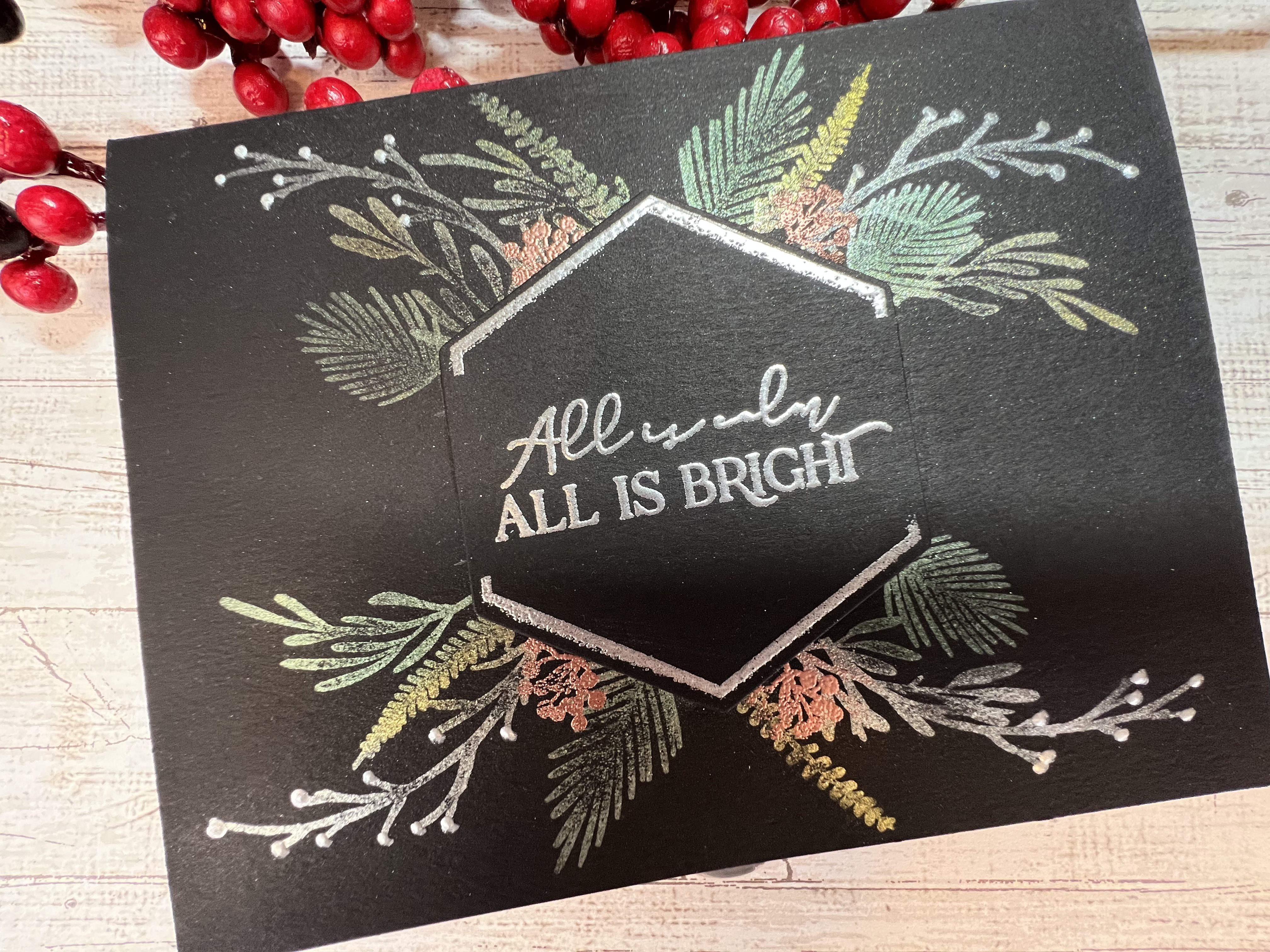
I’ve pulled out the Perfect Pearls several times in the last few months and worked on some background pieces for cards that were ultimately placed in the “drawer of unused card parts.” I love the look of Perfect Pearls but couldn’t come up with a design for an entire project. Sometimes just playing around with crafting supplies helps to put pieces of the project into place…just not in the right order! As I was browsing Pinterest a few days ago I saw a tag idea using a split wreath with the “from” message in the center. And bam, it hit me that this was the layout I wanted for the Scandinavian Christmas project, but using Perfect Pearls and the hexagon element from the set. I love that little spark of excitement when I finally put all the pieces together in my head and I can start actually working on the card physically. Check out the YouTube video for this card here.
I started with a piece of 4″ x 5″ black card stock. I placed a piece of tape horizontally across the center of the card stock as a mask and stamped the hexagon shape onto the paper over the tape using Versamark embossing ink and my Misti. I then applied silver embossing powder and heat set. I pulled off the tape and then placed the piece back into my Misti to stamp the sentiment in the center of the hexagon. Again I applied silver embossing powder and heat set. After the piece was cool I die cut the hexagon shape using the included die. Sentiment piece complete.
I decided to apply the Perfect Pearls directly to the front of the card base instead of using a separate front panel piece. I started by marking the center of the front panel and then lined up the die cut sentiment over this mark. I used a pencil to trace around the top and bottom of the hexagon to give myself a reference point for my stamping.
I placed the card base in my Misti, then I arranged the foliage stamps along the top of the traced hexagon shape, then picked up the stamps with the Misti door. I applied Perfect Medium to the stamps and stamped the images. I needed to use a few of the stamps again so I cleaned the stamps, removed all the stamps from the Misti and repositioned the ones I wanted to reuse as well as placing any additional foliage stamps. Thankfully this set has a lot of foliage stamps to choose from, including both left and right oriented stamps. When I was satisfied with the stamping I took the paper out of the Misti and placed it on a paper towel. This helps to keep the work surface clean while applying the Perfect Pearls powder. I applied the various colors of powder to my stamped images, varying the colors and keeping in mind that I wanted to use some pearl Pops of Color to represent berries on some of the stems. I applied the powder with the smaller brush that is included in the set, and then used the larger fluffy brush to brush off the excess powder. Perfect Pearls does have a sticky element in the powder that helps it to cling to the paper but you must use Perfect Medium to adhere the dry powder. ***See my additional thoughts below on Perfect Pearls***
I repeated these same steps for the bottom of the wreath. I flipped my card stock around 90 degrees in the Misti before stamping the bottom images. See the photo for reference. After removing all the excess powder I ran the card stock through two light mistings of water to fully set the powder. I then used a microfiber cloth to remove any lingering powder on the front panel AWAY from the stamping. I’ve still not had great success with rubbing directly over the powdered images with a cloth. I continue to use the clean fluffy brush to remove powder on the images.
Next I stamped the small berry image several times on both the stop and bottom of the wreath, filling in any open gaps in the foliage. I applied copper embossing powder and heat set. NOTE! The berry stamp will look like a small clump of rocks if you over-ink or press too hard when stamping. I found that a light press is all that is required.
Next I applied Pops of Color to the tips of the white branches. The last step was to pop up the sentiment with foam squares in the center of the card and the card was complete. Honestly the most difficult and time consuming part of the entire card is arranging the foliage stamps in a pattern that looks full and symmetrical.
It has occurred to me that I’d like to post step-by-step photos on my blog posts so I will start doing that with the next card. Of course you can always check for the YouTube video link near the top of each blog post if you’d rather follow along on a video.
I might create one additional Christmas card video/card in the next few days – I have an idea that can’t wait until 2023, so stay tuned!
Honey Bee Stamps Scandinavian Christmas Stamps and Dies set
Lawn Fawn Just Stitching Double Rectangle die set (embosses only, does not cut a frame)
140# coldpress watercolor paper
Hero Arts Hero Hues 111# Cardstock – Cranberry
100# Kraft Cardstock
Tim Holtz/Ranger Distress Oxide Inks – Rustic Wilderness, Faded Jeans, Aged Mahogany, Black Soot
Twine
Heart Embellishments
Pops of Color – Pearl Satin
Pearl Embellishments
I’m taking a little break from the inky night sky backgrounds to create a cute little farmhouse-y holiday card. The Honey Bee Stamps Farmhouse Tree Details stencil has been calling my name from the holiday stamps and dies bin for weeks now. And I’m super happy with the way this card (and all the other cards!) turned out. Yep, once I got started experimenting with the stencil and all the techniques for creating the inky layers it was very hard to call time. Here is the assortment of cards I created this weekend.
Normally when I am making cards for a video (see my YouTube video for this card here) I make a few and then decide which one “made the cut” for the video. I had a difficult time narrowing down the contestants this time. Ultimately all the other cards made a cameo appearance in the video because I fell in love with all of them. Here is how these cards were created, clockwise from top left.
Card #1: I wanted to use the star layers on the stencil so I went with an A7 card (5″ x 7″.) The tree layers were created with Distress Oxide Inks in Evergreen Bough and Pine Needles exactly as I show in the YouTube video that I linked above. Basically, just swatch some ink in a watercolor pan, spray on some water to create an inky watercolor concoction and start painting! The base layer is just the Evergreen Bough and the accent layer is Pine Needles. The base star layer is Distress Oxide in Fossilized Amber and the accent layer is Lawn Fawn Stencil Paste in Gold. I stenciled the wicker basket in with Aged Mahogany and then stenciled the accent layer on the basket with an off-white archival ink. I stenciled the dots and stars onto the tree with Picket Fence Studios Paper Glaze in Winter Snowfall. The sentiment is from Spellbinders Yana’s Christmas Sentiments foiling and die set. I used Spellbinders Bronze hot foil to foil the sentiment. All the cards panels were cut with Waffleflower A2 Layers dies and the double stitching on the front panel of cards 1, 3, 4 &5 was created using Lawn Fawn’s Just Stitching Double Rectangles dies.
Card #2: This card is basically the same as the card I created for the video with the exception of the embellishments. For the red berries in the garland I used the ball point of a ball stylus to stamp on the berries using Nuvo Glacier Paste in Haute Red. I also used the small pearl embellishments on the tree. The greeting is from the same Spellbinders set as in Card #1 and it is also foiled in bronze hot foil.
Card #3: This is the card from the YouTube video that I linked above. Briefly, the base layer of the tree is watercolor paper (4″ x 5 1/2″) on which I have painted the accent layer in Rustic Wilderness with a touch of Faded Jeans to deepen the green, and the burlap sack is Distress Oxide in Aged Mahogany with a touch of Black Soot to deepen the red. The embellishments on the tree are tiny hearts, tiny pearls and some drops of Pops of Color in Pearl Satin to mimic cranberry and popcorn garland. I adhered this watercolor paper layer to a Cranberry cardstock layer (4 1/8″ x 5 3/8″). The base cardstock is A2 Kraft cardstock, 100#. The little bow was created from jute (twine.) The greeting is from Honey Bee Stamps Scandinavian Christmas stamp and die set. It is stamped in Distress Oxide Aged Mahogany ink.
Card #4: This card is exactly the same as card #3 but I used a different sentiment from the Yana’s Christmas Sentiments. This is foiled with Bronze hot foil from Spellbinders. I used a tiny bit more Faded Jeans in the accent layer on the tree to deepen the green.
Card #5: For this card I decided to ink up the stencil with a blending brush and the same Distress Oxide inks as in card #3. For the accent layer I used the Altenew #5 blending brush (it is so small!) and it worked perfectly to pounce on the ink. The tree in this card is much more crisp and defined and it is a totally different look from the watercolor look of the other cards. I used Glossy Accents for the dots on the tree. Once this was dry I brushed on a tiny bit of Perfect Pearls in Gold to give the dots a little sparkle. I also decided to add a little snow to the bottom of the tree. Gina K Designs Glitz Glitter Gel was perfect for snow! Lastly I edged the tree panel with a small amount of Vintage Photo Distress Oxide to give the panel a bit of a rustic, vintage look. I love this card! Be sure to check out the video for all the details for card #3. I have at least one more holiday card coming up this week and then I will switch focus to a crafty mixed media gift project for my girls. I’ll create a post on this project after the holidays. Stay tuned!
Tim Holtz/Ranger Distress Mica Stain – Winter Frost
Wow! Embossing Powder – Twiggy
Sizzix Detail Embossing Powder – Clear
Ranger Perfect Pearls – Perfect Pearl
Ranger Perfect Medium
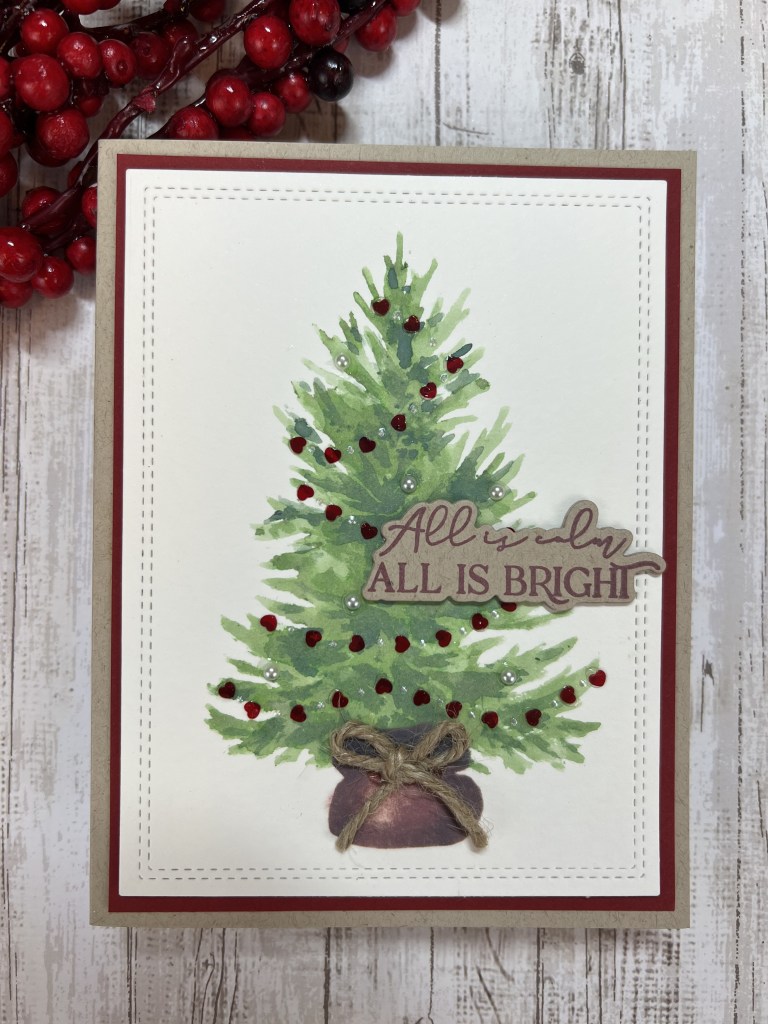
This, my first ever attempt at a slimline card, honestly had me thinking that a card could be cursed. Let me elaborate…
I always make at least one “test” card before filming for YouTube. I am a Girl Scout kinda girl and being prepared is very comforting. Well, this card really threw me for a loop. Starting with my unfamiliarity with slimline stamps and dies…just the sheer size adds a few curve balls to the mix. Now throw in a slight manufacturing issue with Santa (kudos to Customer Support at Trinity Stamps, thank you Taniesa!) a camera malfunction, a faulty memory card, metallic thread that hated my sewing machine….6 hours into filming I was really starting to wonder if I should move on to something….less problematic. I had to leave the studio to ponder my life choices. A cup of tea and a few episodes of Yellowstone later (now that’s a family with problems) I was ready to dive back in with a new attitude.
The thing that I really love about this card is that the ink-blended background is so versatile. A dark purple, blue and black color scheme suggests a very dark and chilly night. The frosty blue and silver make me think of fresh snow and a full moon….you can totally create a mood with the background inking. And that tree stamp? Super fun and so festive. With the huge range of greens, blues and brown inks, there is virtually no limit to what you can do with ink and that tree stamp. And of course it is no secret that I love to showcase beautiful ink colors with a black card base.
I can say my first attempt at a slimline card was frustrating but rewarding. If you decide to make this card (or any 9×4 slimline card) be sure to check out my upcoming blog post for a slimline envelope template using 12″ x 12″ patterned paper.
I have another holiday slimline card in the works. Slimlines will not defeat me! This one involves Copics and watercolors and the cutest tall snowman stamp I’ve seen. Check back soon for all the details.