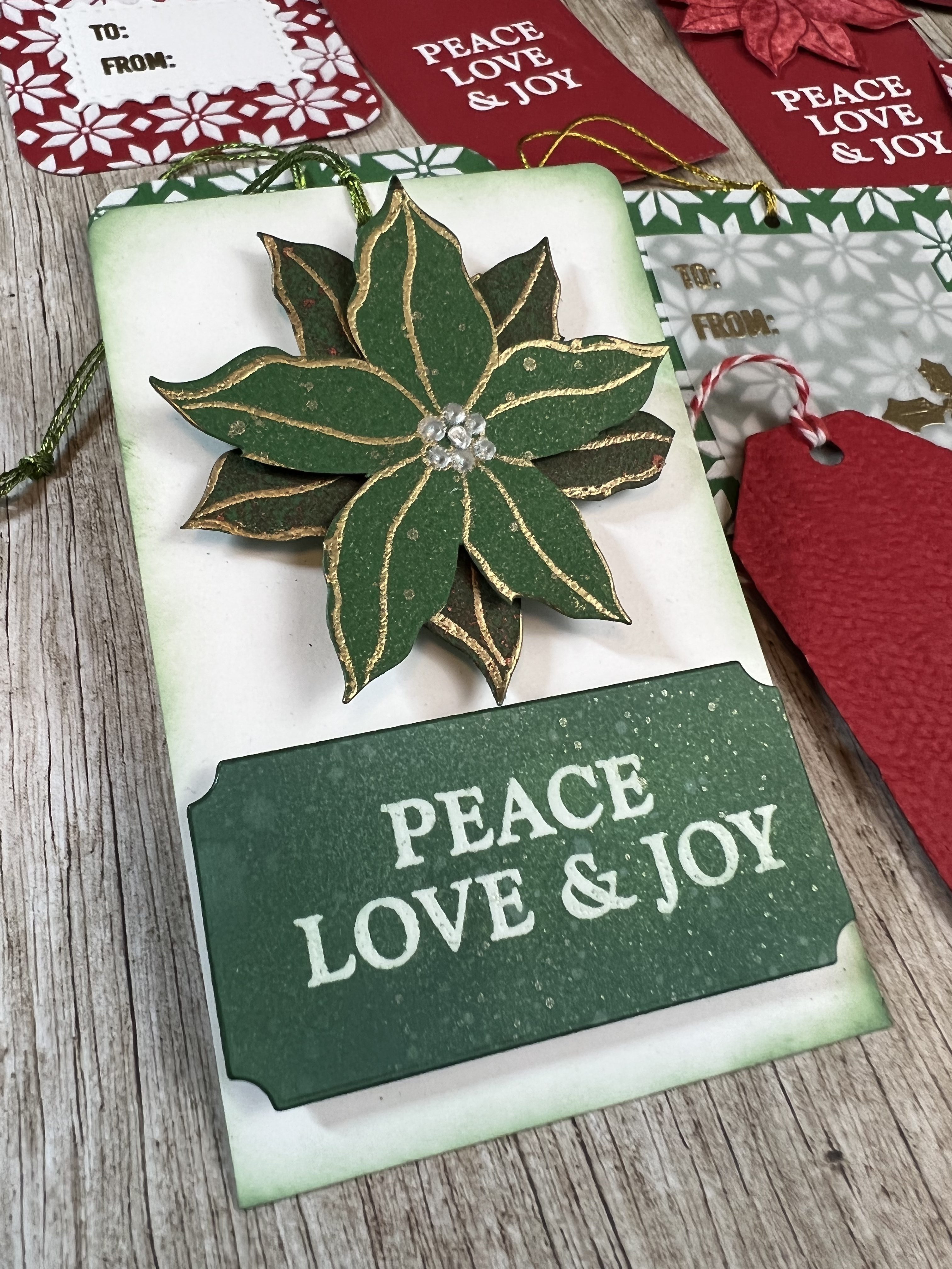
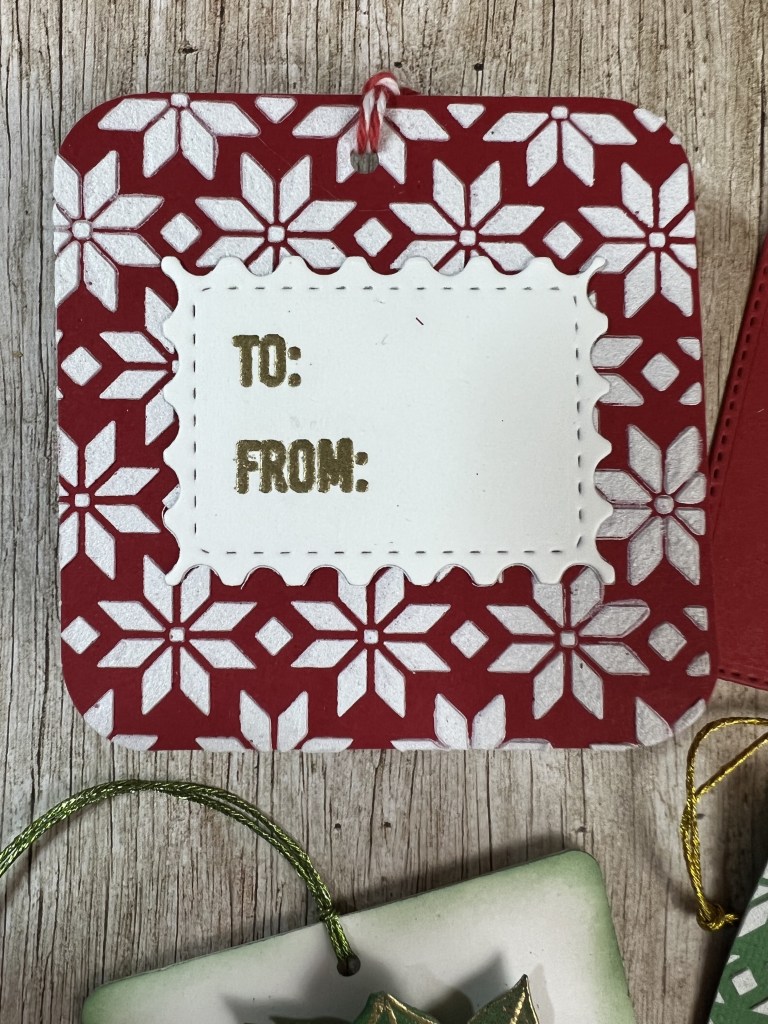
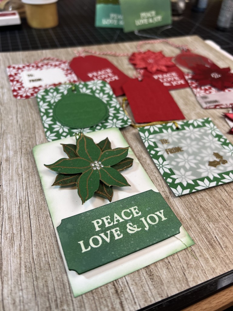
Uncategorized

Add Extra Dimension to 3D Embossed Images with Inking!

Materials List:

  • Sizzix by Tim Holtz Pine Branches 3D Embossing Folder
  • Gina K Designs Winter Wonderland Die Set
  • Hero Arts Year Round Messages
  • Hero Arts Hero Hues 111# Card Stock, 4 1/8″ x 5 3/8″ – Palm
  • 135# Cold Press Watercolor Paper – 4″ x 5 1/4″
  • A2 Card Base – Neenah Classic Crest Solar White, 5 1/2″ x 8 1/2″ flat
  • Distress Embossing Glaze – Rustic Wilderness & Twisted Citron
  • Distress Oxide Ink – Rustic Wilderness
  • Distress Oxide Crayon – Fresh Balsam
  • Watercolor Palette – Jazper Stardust, Cob Matte
  • VersaMark Watermark Ink
  • Detail Silver Embossing Powder

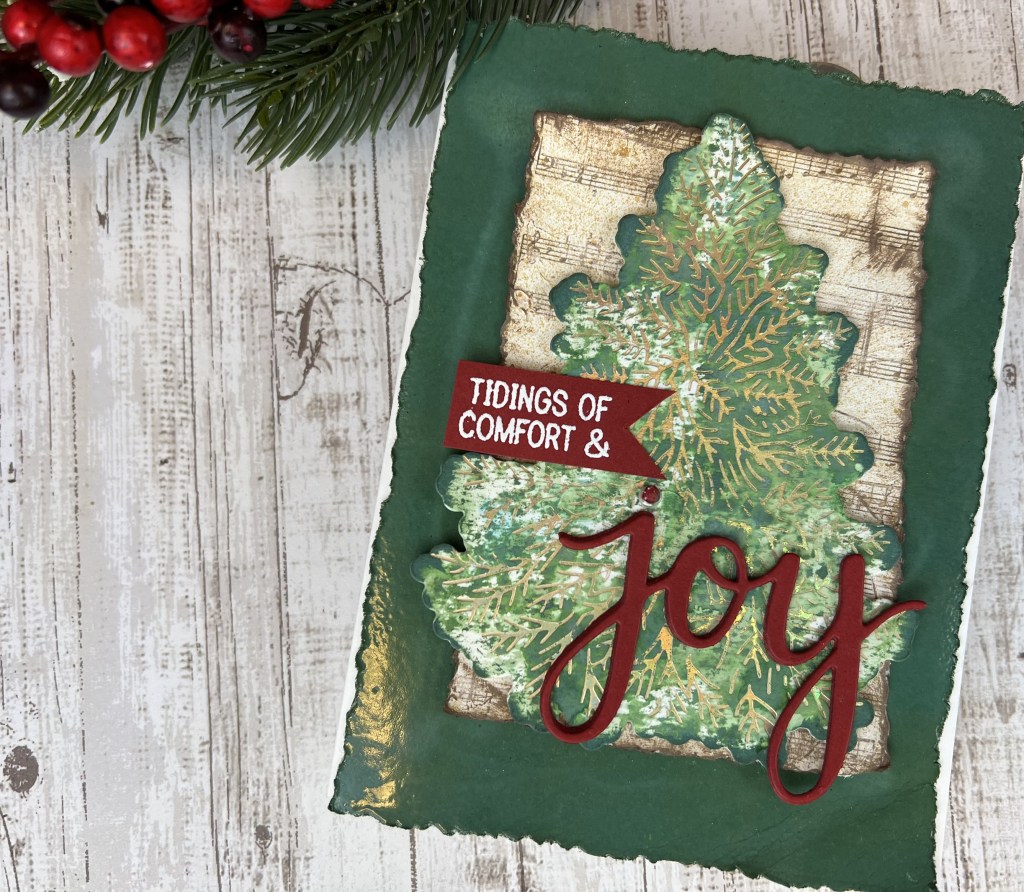
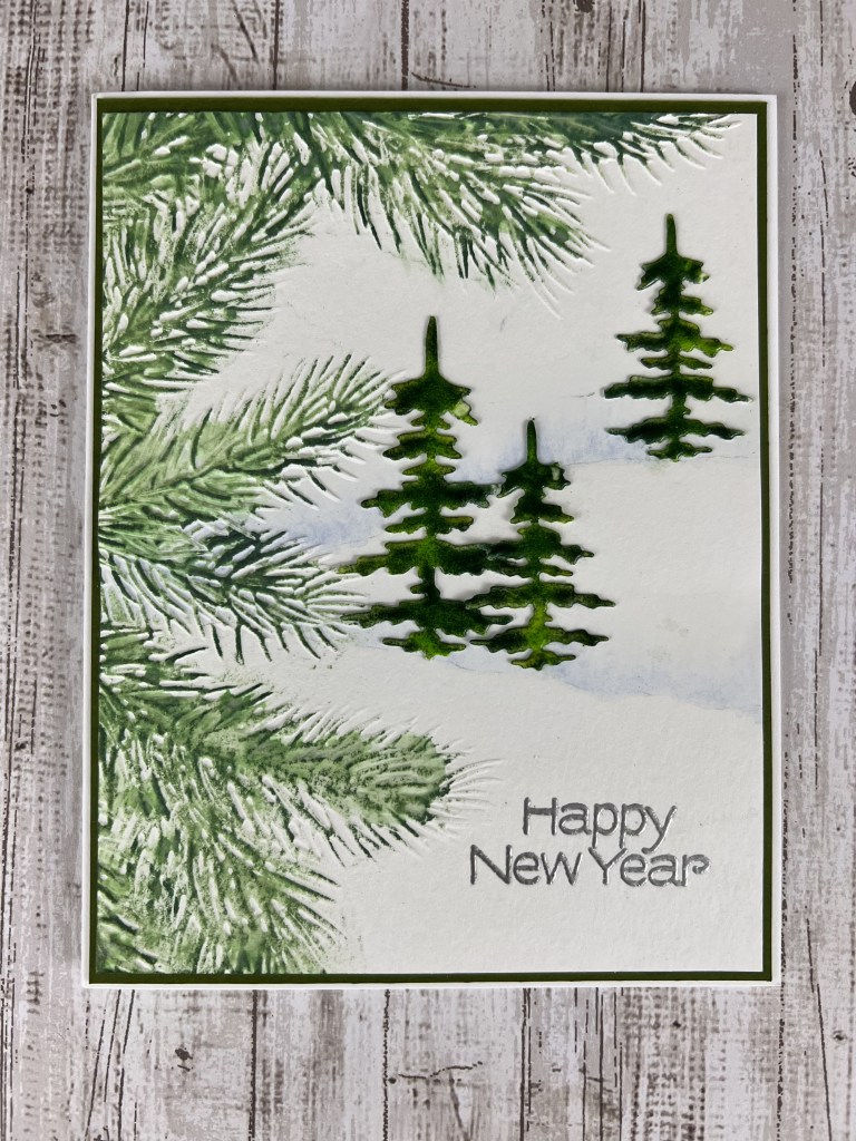
I have a few upcoming projects featuring glazed images – This is the first! I love the small, cool color palette on this card. It feels frosty! The YouTube video is here if you’d like to see more detail.

I started with the watercolor panel and lightly pencilled in two faint lines for hills, from approximately center left on the panel to the top 1/3 mark on the right and bottom 1/3 mark on the right (I refer to these as upper hill and lower hill.) I erased most of the pencil marks, leaving just enough to be able to see in order to add the watercolor. Using clean water and a #4 round watercolor brush I added a light layer of water along the top of each line, extending up approx an inch. *I created a very light wash and a darker wash of Cob Matte in my palette. I applied the lighter wash into the water line I created on the panel, allowing the color to blend with the water and start to spread up from the line. I added additional color along the lines until I had a shade that best resembled snow banks. Allow to dry. *Note: If you don’t have watercolor or don’t want to use watercolor for this step you could simply freehand some hillsides using paper templates, Distress Oxide Tumbled Glass ink and a blender brush. Apply lightly and build the color until you have a shade that you like!

Next I misted the back of the panel lightly with water and then placed it front side up in my Pine Branch embossing folder. The folder is larger than the panel, so I lined up the panel from the top left edge. I ran this sandwich through my Platinum 6 three times to get a good impression.

It isn’t necessary to create the trees next but I was excited to try the Rustic Wilderness/Twisted Citron color combo. I die cut three trees out of a cover-weight cardstock. Heavier is better when inking and heating up these images. I cut one large tree and two small trees from the set. I set up my work surface with a folded paper towel (where I’ll apply the embossing ink) and two sheets of copy paper that I folded and then opened flat (to catch the extra embossing glaze as I apply.) To glaze the trees I followed this process:

  • Apply embossing ink to the entire front surface of the image, taking care to coat the tips of the branches
  • Apply Twisted Citron Embossing Glaze along the center of the image, top to bottom
  • Apply Rustic Wilderness Embossing Glaze to the outside edges, ensuring that the entire surface is covered with glaze.
  • Heat the glaze with a heat tool until the glaze is shiny. Don’t overheat! If it bubbles it is too hot!
  • Repeat this process to create two additional layers of glaze. On the 3rd layer you can fine-tune the light/dark ratio to create interesting highlight and shadow!

I set the trees aside to cool while I worked on the inking on the embossed area.

For the inking I started with the Fresh Balsam Distress Crayon. I used my finger to apply the ink along the center of each pine branch, avoiding the tips of the branches. Next I used the Rustic Wilderness ink pad to lightly color the raised image on the panel. Holding the ink pad parallel to the panel I lightly dragged the pad over the embossed area so that only the raised area was in contact with the pad. This takes a little practice! Rest assured that any small stray areas of ink can usually be removed with a Tombow Mono sand eraser. Finally I used some clean water, a paper towel and the tip of my finger to very gently tap a tiny amount of water over the inked area, again avoiding the tips of the branches. The object here is to start to blend the lighter green crayon ink with the darker green to create dimension. The lighter green ink starts to move down to the paper layer and the darker green softens but stays on the pine needles. It is a cool effect!

Next I placed the panel into my Misti and lined up the “Happy New Year” stamp on the bottom right side of the panel. I inked the stamp with VersaMark embossing ink and then applied the detail silver embossing powder. I heat-set the powder and it was time to assemble the card.

This card has two panels that layer onto the card base. There will be a 1/16″ border around each panel. I started by glueing the trees onto the panel; the large tree and one small tree on the lower hill and the other small tree on the upper hill near the right edge of the panel. I followed the contour of the hill when deciding on placement as it added a bit more realism. I glued this panel onto the Palm cardstock, again leaving a 1/16″ margin on all sides, and then glued this assembled piece to the card base. Card complete! This one came together very quickly so it is a great card for mass producing. You could even switch out the “Happy New Year” greeting for a “Thank You” and use this design for your holiday Thank You cards.

I hope your holiday season was wonderful. I’m looking forward to some Valentine’s Day design work in the coming weeks. Stay tuned!

Cheers!

Cynthia

Uncategorized

Pair Perfect Pearls with Black Card Stock for a Card that Glows!

Materials List:

  • Honey Bee Stamps Scandinavian Christmas Stamp and Die Set
  • Hero Arts Hero Hues 111# Card Stock – Pitch Black
  • Ranger Perfect Pearls: Confetti White, Sunflower Sparkle, Mint
  • Ranger Perfect Medium
  • Versamark Embossing Ink
  • Ranger Detail Silver Embossing Powder
  • Pops of Color – Satin Pearl
  • Wow! Embossing Powder – Metallic Copper

I’ve pulled out the Perfect Pearls several times in the last few months and worked on some background pieces for cards that were ultimately placed in the “drawer of unused card parts.” I love the look of Perfect Pearls but couldn’t come up with a design for an entire project. Sometimes just playing around with crafting supplies helps to put pieces of the project into place…just not in the right order! As I was browsing Pinterest a few days ago I saw a tag idea using a split wreath with the “from” message in the center. And bam, it hit me that this was the layout I wanted for the Scandinavian Christmas project, but using Perfect Pearls and the hexagon element from the set. I love that little spark of excitement when I finally put all the pieces together in my head and I can start actually working on the card physically. Check out the YouTube video for this card here.

I started with a piece of 4″ x 5″ black card stock. I placed a piece of tape horizontally across the center of the card stock as a mask and stamped the hexagon shape onto the paper over the tape using Versamark embossing ink and my Misti. I then applied silver embossing powder and heat set. I pulled off the tape and then placed the piece back into my Misti to stamp the sentiment in the center of the hexagon. Again I applied silver embossing powder and heat set. After the piece was cool I die cut the hexagon shape using the included die. Sentiment piece complete.

I decided to apply the Perfect Pearls directly to the front of the card base instead of using a separate front panel piece. I started by marking the center of the front panel and then lined up the die cut sentiment over this mark. I used a pencil to trace around the top and bottom of the hexagon to give myself a reference point for my stamping.

I placed the card base in my Misti, then I arranged the foliage stamps along the top of the traced hexagon shape, then picked up the stamps with the Misti door. I applied Perfect Medium to the stamps and stamped the images. I needed to use a few of the stamps again so I cleaned the stamps, removed all the stamps from the Misti and repositioned the ones I wanted to reuse as well as placing any additional foliage stamps. Thankfully this set has a lot of foliage stamps to choose from, including both left and right oriented stamps. When I was satisfied with the stamping I took the paper out of the Misti and placed it on a paper towel. This helps to keep the work surface clean while applying the Perfect Pearls powder. I applied the various colors of powder to my stamped images, varying the colors and keeping in mind that I wanted to use some pearl Pops of Color to represent berries on some of the stems. I applied the powder with the smaller brush that is included in the set, and then used the larger fluffy brush to brush off the excess powder. Perfect Pearls does have a sticky element in the powder that helps it to cling to the paper but you must use Perfect Medium to adhere the dry powder. ***See my additional thoughts below on Perfect Pearls***

I repeated these same steps for the bottom of the wreath. I flipped my card stock around 90 degrees in the Misti before stamping the bottom images. See the photo for reference. After removing all the excess powder I ran the card stock through two light mistings of water to fully set the powder. I then used a microfiber cloth to remove any lingering powder on the front panel AWAY from the stamping. I’ve still not had great success with rubbing directly over the powdered images with a cloth. I continue to use the clean fluffy brush to remove powder on the images. 

Next I stamped the small berry image several times on both the stop and bottom of the wreath, filling in any open gaps in the foliage. I applied copper embossing powder and heat set. NOTE! The berry stamp will look like a small clump of rocks if you over-ink or press too hard when stamping. I found that a light press is all that is required. 

Next I applied Pops of Color to the tips of the white branches. The last step was to pop up the sentiment with foam squares in the center of the card and the card was complete. Honestly the most difficult and time consuming part of the entire card is arranging the foliage stamps in a pattern that looks full and symmetrical. 

It has occurred to me that I’d like to post step-by-step photos on my blog posts so I will start doing that with the next card. Of course you can always check for the YouTube video link near the top of each blog post if you’d rather follow along on a video. 

I might create one additional Christmas card video/card in the next few days – I have an idea that can’t wait until 2023, so stay tuned!

Cheers!

Uncategorized

Create a Watercolor Look with Inks!

Materials List:

  • Honey Bee Stamps Farmhouse Tree Stencil
  • Honey Bee Stamps Scandinavian Christmas Stamps and Dies set
  • Lawn Fawn Just Stitching Double Rectangle die set (embosses only, does not cut a frame)
  • 140# coldpress watercolor paper
  • Hero Arts Hero Hues 111# Cardstock – Cranberry
  • 100# Kraft Cardstock
  • Tim Holtz/Ranger Distress Oxide Inks – Rustic Wilderness, Faded Jeans, Aged Mahogany, Black Soot
  • Twine
  • Heart Embellishments
  • Pops of Color – Pearl Satin
  • Pearl Embellishments

I’m taking a little break from the inky night sky backgrounds to create a cute little farmhouse-y holiday card. The Honey Bee Stamps Farmhouse Tree Details stencil has been calling my name from the holiday stamps and dies bin for weeks now. And I’m super happy with the way this card (and all the other cards!) turned out. Yep, once I got started experimenting with the stencil and all the techniques for creating the inky layers it was very hard to call time. Here is the assortment of cards I created this weekend.

Normally when I am making cards for a video (see my YouTube video for this card here) I make a few and then decide which one “made the cut” for the video. I had a difficult time narrowing down the contestants this time. Ultimately all the other cards made a cameo appearance in the video because I fell in love with all of them. Here is how these cards were created, clockwise from top left.

Card #1: I wanted to use the star layers on the stencil so I went with an A7 card (5″ x 7″.) The tree layers were created with Distress Oxide Inks in Evergreen Bough and Pine Needles exactly as I show in the YouTube video that I linked above. Basically, just swatch some ink in a watercolor pan, spray on some water to create an inky watercolor concoction and start painting! The base layer is just the Evergreen Bough and the accent layer is Pine Needles. The base star layer is Distress Oxide in Fossilized Amber and the accent layer is Lawn Fawn Stencil Paste in Gold. I stenciled the wicker basket in with Aged Mahogany and then stenciled the accent layer on the basket with an off-white archival ink. I stenciled the dots and stars onto the tree with Picket Fence Studios Paper Glaze in Winter Snowfall. The sentiment is from Spellbinders Yana’s Christmas Sentiments foiling and die set. I used Spellbinders Bronze hot foil to foil the sentiment. All the cards panels were cut with Waffleflower A2 Layers dies and the double stitching on the front panel of cards 1, 3, 4 &5 was created using Lawn Fawn’s Just Stitching Double Rectangles dies.

Card #2: This card is basically the same as the card I created for the video with the exception of the embellishments. For the red berries in the garland I used the ball point of a ball stylus to stamp on the berries using Nuvo Glacier Paste in Haute Red. I also used the small pearl embellishments on the tree. The greeting is from the same Spellbinders set as in Card #1 and it is also foiled in bronze hot foil.

Card #3: This is the card from the YouTube video that I linked above. Briefly, the base layer of the tree is watercolor paper (4″ x 5 1/2″) on which I have painted the accent layer in Rustic Wilderness with a touch of Faded Jeans to deepen the green, and the burlap sack is Distress Oxide in Aged Mahogany with a touch of Black Soot to deepen the red. The embellishments on the tree are tiny hearts, tiny pearls and some drops of Pops of Color in Pearl Satin to mimic cranberry and popcorn garland. I adhered this watercolor paper layer to a Cranberry cardstock layer (4 1/8″ x 5 3/8″). The base cardstock is A2 Kraft cardstock, 100#. The little bow was created from jute (twine.) The greeting is from Honey Bee Stamps Scandinavian Christmas stamp and die set. It is stamped in Distress Oxide Aged Mahogany ink.

Card #4: This card is exactly the same as card #3 but I used a different sentiment from the Yana’s Christmas Sentiments. This is foiled with Bronze hot foil from Spellbinders. I used a tiny bit more Faded Jeans in the accent layer on the tree to deepen the green.

Card #5: For this card I decided to ink up the stencil with a blending brush and the same Distress Oxide inks as in card #3. For the accent layer I used the Altenew #5 blending brush (it is so small!) and it worked perfectly to pounce on the ink. The tree in this card is much more crisp and defined and it is a totally different look from the watercolor look of the other cards. I used Glossy Accents for the dots on the tree. Once this was dry I brushed on a tiny bit of Perfect Pearls in Gold to give the dots a little sparkle. I also decided to add a little snow to the bottom of the tree. Gina K Designs Glitz Glitter Gel was perfect for snow! Lastly I edged the tree panel with a small amount of Vintage Photo Distress Oxide to give the panel a bit of a rustic, vintage look. I love this card! Be sure to check out the video for all the details for card #3. I have at least one more holiday card coming up this week and then I will switch focus to a crafty mixed media gift project for my girls. I’ll create a post on this project after the holidays. Stay tuned!

Cheers!

Cynthia

Uncategorized

Combine Stamps to Create the Perfect Scene

Materials List:

  • Trinity Stamps Christmas Magic Stamp & Die Set
  • Brutus Monroe Ho Ho Ho Stamp and Die Set
  • 140# coldpress watercolor paper
  • Hero Arts Hero Hues 111# Cardstock – Pitch Black
  • Tim Holtz/Ranger Distress Spray Stain – Antique Linen, Chipped Sapphire, Salty Ocean, Black Soot
  • Tim Holtz/Ranger Distress Oxide Inks – Rustic Wilderness, Salvaged Patina, Aged Mahogany, Ground Espresso
  • Tim Holtz/Ranger Distress Mica Stain – Winter Frost
  • Wow! Embossing Powder – Twiggy
  • Sizzix Detail Embossing Powder – Clear
  • Ranger Perfect Pearls – Perfect Pearl
  • Ranger Perfect Medium

This, my first ever attempt at a slimline card, honestly had me thinking that a card could be cursed. Let me elaborate…

I always make at least one “test” card before filming for YouTube. I am a Girl Scout kinda girl and being prepared is very comforting. Well, this card really threw me for a loop. Starting with my unfamiliarity with slimline stamps and dies…just the sheer size adds a few curve balls to the mix. Now throw in a slight manufacturing issue with Santa (kudos to Customer Support at Trinity Stamps, thank you Taniesa!) a camera malfunction, a faulty memory card, metallic thread that hated my sewing machine….6 hours into filming I was really starting to wonder if I should move on to something….less problematic. I had to leave the studio to ponder my life choices. A cup of tea and a few episodes of Yellowstone later (now that’s a family with problems) I was ready to dive back in with a new attitude.

The thing that I really love about this card is that the ink-blended background is so versatile. A dark purple, blue and black color scheme suggests a very dark and chilly night. The frosty blue and silver make me think of fresh snow and a full moon….you can totally create a mood with the background inking. And that tree stamp? Super fun and so festive. With the huge range of greens, blues and brown inks, there is virtually no limit to what you can do with ink and that tree stamp. And of course it is no secret that I love to showcase beautiful ink colors with a black card base.

I can say my first attempt at a slimline card was frustrating but rewarding. If you decide to make this card (or any 9×4 slimline card) be sure to check out my upcoming blog post for a slimline envelope template using 12″ x 12″ patterned paper.

I have another holiday slimline card in the works. Slimlines will not defeat me! This one involves Copics and watercolors and the cutest tall snowman stamp I’ve seen. Check back soon for all the details.

Cheers!

Cynthia

Uncategorized

Snowflake Layers! So Versatile!

Materials List:

  • Trinity Stamps Big Snowflake Foiling and Die Set
  • Simon Says Stamp! Christmas Blessings
  • Honey Bee Stamps Snowfall Background Stencil
  • Distress Mica Stain – Shiny Bauble
  • Picket Fence Studios – Paper Glaze, Winter Snowfall
  • Spellbinders Glimmer Foil – Moondust & Speckled Prism
  • Ranger/Wendy Vecchi Archival Ink – Watering Can
  • Tim Holtz/Ranger Distress Crayon – Brushed Pewter
  • Altenew Pigment Ink – Sapphire
  • Wow! Superfine Embossing Powder – Metallic Silver
  • Versamark Embossing Ink
  • Watercolor Paper – 140 Coldpress
  • American Crafts glitter cardstock – white
  • Recollections Music Stamp

In my last video and post I gave huge props to the Trinity Stamps Foiled Pine Foiling and Die Set, and guess what? There is a snowflake set as well! Those designers were hard at work for the holiday season in 2022! For this card I pulled out the Recollections music stamp again (because it is gorgeous!) but used some Shiny Bauble Distress Mica Stain and some Distress Crayons to accent the music layer. I made three versions of the card. Here are the details…

Card #1: For this card I wanted to bring back an old favorite – Picket Fence Studios Paper Glaze in Winter Snowfall. This stuff is magical. I used the Honey Bee Stamps Snowfall Background Stencil to stencil on the snow with the Paper Glaze. While the background was drying I moved on to the music layer. I used the Recollections music stamp from the last post to stamp the music image on 140 lb cold press watercolor paper using archival ink in Watering Can. I tore off the edges of the paper down to the outline of the music stamp, then I very lightly misted with Distress Mica Stain in Shiny Bauble. Once the ink was dry I ran the edges of the paper through a small amount of Brushed Pewter Distress Crayon mixed with a small amount of water. This really helps to delineate this layer. For the snowflake layer I die cut the largest snowflake three times: once on light blue layering weight cardstock and twice more on white layering weight cardstock. I stacked and glued these three layers for dimension. I then cut the smallest snowflake from white glitter cardstock (the pressed kind, no mess!) I glued this layer to the blue base layer. On to the greeting. For this card I chose the “Holiday Wishes to You” greeting from the Simon Says Stamp Christmas Blessings stamp set. I stamped the greeting with clear embossing ink, applied silver metallic detail embossing powder, heat set, then die cut the greeting. To assemble the card I adhered the music layer to the card base with a strong adhesive (I love Tombow multi) and then adhered the snowflake in the middle of the music panel using the same adhesive. I used tiny foam squares, some of them I cut into two slivers, to pop up the greeting in the center of the snowflake. Card 1 complete!

Card #2: For the second card I used a snowflake 3D embossing folder for the front panel background. I created the music panel exactly the same way as in card #1, with the exception of the edge treatment on the panel. I used the Shiny Bauble Mica Stain for this step. The snowflake was created in two layers. The bottom layer is cut from white craft foam using the largest snowflake die, and the top layer is cut from layering weight light blue cardstock using the smallest die. I used the foiling plate and Spellbinders Hot Foil in Speckled Prism to hot foil an accent on the top snowflake. The greeting is stamped and cut from the same Christmas Blessings set, but stamped in Altenew’s Sapphire pigment ink. The card was assembled the same as card #1. I used strong adhesive for all layers.

Card #3: I wanted a little more flash on this card so I went with an embossed silver metallic frame for the front panel. I cut the center of the panel using Momenta’s Ornate Frames, 3rd largest frame. I centered the opening on the card base with the music panel showing through the opening. The base layer for the snowflake is the same light blue cardstock which was adhered to two additional layers of white cardstock cut outs. The hot foil on this snowflake is Spellbinders Moondust (lovely color!). The greeting is stamped in Distress Oxide in Uncharted Mariner and all layers of the card were adhered with strong adhesive.

The snowflake die was very versatile, cut fabulously and is the perfect size for an A2 or larger card. The cards came together quickly and easily. I’ll enjoy sending these to friends and family this season.

Cheers!

Cynthia

Uncategorized

Create a Mixed Media Holiday Look with Simple Card Making Techniques!

Materials List:

  • Trinity Stamps Foiled Pine Foiling Plate & Die Set
  • Hero Arts Joy Stamp & Die Set
  • Hero Arts Hero Hues 111# Cardstock – Cranberry
  • Distress Spray Stain – Antique Linen
  • Distress Oxide Inks – Rustic Wilderness, Tumbled Glass, Vintage Photo
  • Spellbinders Glimmer Foil – Aura
  • Ranger/Wendy Vecchi Archival Ink – Potting Soil
  • Liquitex – Crackle Paste

Reboot! For the record, I completely reworked a card that I posted here a few days ago. It was one of those cards…one where you like it but you don’t LOVE IT and it sort of sits in your thoughts until you go back to the craft table and take another look at it. The result is a lighter feel, cooler colors and a cool crackle paste/antiqued music layer that I really love.

This card was inspired by so many beautiful holiday mixed media Pinterest projects – I spent my design day trying out some techniques and adapting them to typical card making techniques. The result is this card of layered, stamped and embossed goodness. I am so enthralled with background stamping, covered by layers of semi-transparent ink and stenciling. Watch for many cards in the future that showcase these techniques. Meanwhile, check out the video for this card here.

I started with the top layer of the card (the tree layer) with 140# cold pressed watercolor paper. I created an ink puddle on my glass mat with Distress Oxide inks in Tumbled Glass and Rustic Wilderness. I pressed the watercolor paper into the ink (systematically?) to create the first layer of color. The Tumbled Glass acts as a highlight behind the darker Rustic Wilderness so this ink was applied sparingly. After drying this first layer I inked up the mat again with only Rustic Wilderness and a small amount of water to create a darker top layer of color. The idea here is to create a pattern of color that is the background for the foiling of the branches on the pine tree. This will make much more sense when you watch the video!

The next step is to die cut the tree shape with the included outline die. I lined up the outline die on the inked piece until I found just the right view and then ran the paper and die through my die cut machine. Next I created a foiling stack for my Glimmer machine using Spellbinders Aura Glimmer Foil. This foil is beautiful! In the video I describe it as a cross between gold and silver foil but more accurately it is a cross between gold and iridescent foil. I ran the stack through my die cut machine and the result was truly stunning.

Next I worked on the deckled edge paper for the music and embossed layers of the card. I traced faint pencil lines for two panels: 4 1/4″ x 5 1/2″ and 3″ x 4 1/4″. I used a deckle edge ruler to tear the paper along the pencil lines.

Using the smaller deckle edge paper I stamped the music block stamp onto the paper using Archival ink in Potting Soil. I then added a layer of Crackle Paste and allowed the piece to dry. Once dry I antiqued the panel by spraying lightly with Distress Spray Stain in Antique Linen, then used the Distress Oxide ink pad in Vintage Photo to lightly ink the edges and a few raised spots on the face of the panel. Panel complete!

The bottom layer starts with the 4″ x 5 1/4″ deckle edge panel. I inked up a “frame” on the front of the paper using Rustic Wilderness ink, heat-dried the ink, then applied a layer of embossing ink using an old ink pad that gets a lot of abuse. I applied clear embossing powder then heat set the powder. I repeated the embossing ink/embossing powder steps once more. So easy but so much shine to this layer!

For the greeting I chose Hero Arts’ Joy stamp and die set. The large greeting and die are perfect for this card. I chose a cranberry cardstock for the greeting and cut the “Joy” word three times for layering. I stamped the words “Tidings of comfort &” on cranberry cardstock, applied embossing ink and white embossing powder, then heat set. I cut the greeting into a banner shape. Whew! Finally all elements are ready to assemble the card.

For a card base I used a heavy white cardstock cut to 5 1/2″ x 8 1/2″, scored at 4 1/4″. I folded and pressed the scored edge and used a strong liquid adhesive to apply the glazed layer to the card base front. I did not apply adhesive near the edges of the glazed layer as I really love how this layer has so much dimension and curls up slightly on the edges. This adds to the mixed media look that I was going for with this card. I then added the music layer in the center of the glazed layer. The last layer, the tree was applied using foam squares for even more dimension. I finished off this card by adhering the greeting strip and “joy” die cut near the bottom of the foiled tree. I applied the dot over the “j” using a dot of Pops of Color rather than trying to glue together three small dots.

I really love the look of this card and am working on a snowflake version that might make it to video. So many ideas, so little time.

Cheers!

Cynthia

Uncategorized

Stretch a Holiday Card Kit – Gift Tags!

Materials List:

  • Hero Arts Make Yourself at Home November 2022 Card Kit
  • Copic Markers: R59, R37, R21, G28, G24, YR14, E99
  • Picket Fence Studios Paper Glaze – Winter Snowfall
  • Simon Says Stamp! Acetate Sheet
  • Detail White Embossing Powder
  • Tim Holtz-Ranger Distress Mica Stain – Tart Cranberry & Brushed Pewter
  • Tim Holtz-Ranger Distress Oxide Ink – Rustic Wilderness
  • Scrapbook.com Pops of Color – White Satin
  • Lawn Fawn Stencil Paste – Gold
  • Vellum
  • Sizzix 3D Sweater Embossing Folder
  • Momenta Ornate Stacked Frames Dies
  • Lawn Fawn Circle Stitched Tags
  • Gina K Holiday Tapestry Stamp Set

After making lots of cards with the Hero Arts/Joann Make Yourself at Home November 2022 card kit I decided to stretch the supplies even further and create some coordinating gift tags. This kit delivers on possibilities! I was able to create several tags using just the elements in the kit and it was fun to go through my stash to find tag dies to die cut everything to size.

My favorite tag is the green 3-D poinsettia that pops off the tag with gold embossing, a spray of brushed pewter mica spray and some Pops of Color dots. I heat embossed the sentiment with white detail embossing powder and inked the edges of the tag with Distress Oxide ink in Rustic Wilderness. I used foam squares to pop up the top layer of the poinsettia and curled the edges of the leaves just a bit. The colors in this tag feel so holiday-ish and I really love it.

The simplest tag (by far) was the sweater texture tag. I cut two tags to size with a tag die, misted one lightly with water, placed it in a 3D sweater texture embossing folder and then ran it through my die cut machine. I stamped “To:” and “From:” on the second tag and glued the second tag on the back of the embossed tag. This is one that can be mass produced very quickly in various colors and it is super cute.

And of course I had to use the poinsettia stencil again. I loved this textured background in the original series of cards and I knew I wanted to use it again on the tags. I stenciled both the cranberry and pine cardstock with the stencil and paper glaze, cut the tags to size with a tag die and then created various overlay layers with vellum or white cardstock for the “To:” and “From:” stamps. I had so many ideas for this background…Have you ever had so many ideas that you just know you can’t possibly remember all of them? Yes, that happened.

The acetate overlay is also very simple but feels so Christmas-y. I used an anti-static powder tool on both sides of the acetate die cut, then inked with embossing ink and applied detail silver embossing powder. This is heat-resistant acetate from Simon Says Stamp! but make sure your heat tool is primed (turn on for about 20 seconds before you start to heat emboss) for quick results with absolutely no warping!

There are other tags in the photos above that I haven’t detailed so drop me a line if you’d like more information. I hope you are able to use this info to stretch your supplies a little bit further and also create some fun and useful gift tags in the process. My next project is a gift box and gift card holder using patterned paper from your stash. Stay tuned!

Cheers!

Cynthia

Uncategorized

Let’s Celebrate Holiday Card Kits!

Materials List:

  • Hero Arts Make Yourself at Home November 2022 Card Kit
  • XPress IT Blending Card Paper
  • Copic Markers: R59, R37, R21, G28, G24, YR14, E99
  • Picket Fence Studios Paper Glaze – Winter Snowfall
  • My Favorite Things Essential Stitched Sentiment Strips
  • Simon Says Stamp! Acetate Sheet
  • Detail White Embossing Powder
  • Tim Holtz-Ranger Distress Mica Stain – Tart Cranberry
  • Scrapbook.com Pops of Color – White Satin
  • Sakura Glaze Pen

This card kit is a collab between Hero Arts and Joann (yes, the fabric/craft/everything store) and let me just say that I’m pretty certain that anything these two do together is going to be amazing. And I’m not wrong here. This kit is LOADED with crafting goodies – two ink cubes, twine, embossing ink, coordinating colored cardstock, A2 notecards, envelopes, stamps, dies AND a stencil. For $30. Seriously??? Wait, I forgot the gold embossing powder….. It’s almost unreal.

I was so impressed with this kit that I decided to create a video, so I spent the better part of last Sunday playing around with all the glorious cardmaking goodies to see what I could create. I think the photo above says everything. I made four cards and I was so happy with each of them, like, would mass produce any of the four as my Christmas card for 2022. (Okay, maybe not the Copic version because that card took a minute to produce but wow, that stamp is a perfect holiday floral.)

Card 1: This card was the quickest and I love the clean and simple look. I used only elements in the kit for the card, some quick stamping and I tied on the twine with a few loops and a cute bow. I glued a white panel inside the card (also from another notecard in the kit) to hide the twine on the inside and card #1 was complete.

Card 2: This card was my absolute favorite for its classic red and white color scheme and the stunning texture glaze background. I used the stencil in the kit and Picket Fence Studios Velvet Paper Glaze in Winter Snowfall to create the snowflakes on the front of this card. I’m in love with this look and I’ll be using more of the paper glazes in upcoming cards. I stamped and embossed the Peace, Love, & Joy greetings on the cranberry cardstock, applied white embossing powder and heat set. A quick die cut with a MFT sentiment strip die and I was ready to place all these goodies on a cranberry card base. So easy, yet so pretty. My favorite card combo!

Card 3: This card was the most time-intensive but how beautiful is that floral stamp? It begged for Copic coloring. I love choosing Copics and experimenting with blending for florals. I have an entire Pinterest board dedicated to Copic coloring. I’m still new to this and rely heaving on the expert and some of these people are truly visionary when it comes to Copic markers. After stamping the entire stamp and one extra poinsettia; coloring and die cutting, I created a fun and sparkly background using Tim Holtz-Ranger Distress Mica Stain in Tart Cranberry. It’s a perfect mica stain for holiday cards and the shimmer really ups the Wow! factor in this card. I adhered the floral die cut on the panel with some strong adhesive, adhered the panel on the card with Gina K tape runner and then added some pizazz with Pops of Color on the larger berries and Sakura Glaze pen on the smaller berries. That bold “Merry Christmas” stamp really pops with the gold embossing against the Pine cardstock in the greeting strip. The same Pine cardstock serves as the card base and this helps to pull the whole look together in this festive, floral holiday card.

Card 4: For the final card I used a sheet of acetate from Simon Says Stamp! that is heat-resistant, which makes it perfect for heat embossing. I really love the look of an embossed acetate overlay and the green card base and cranberry-red poinsettias behind the overlay shout “Holidays” like no greeting strip ever could. But what about that cranberry and gold-embossed greeting strip that takes center stage on this card? I love everything about this card and it will definitely be in the first string line up of cards I’m sending this season.

Tomorrow I’m enjoying a much needed and long overdue spa day (yay me!) and then on Wednesday I’ll post some holiday gift tags I created from this same Hero Arts kit. Check back here for that post and as always, thanks for stopping by!

Cheers!

Cynthia