Whether your cardmaking jam is simple or complex or anywhere in between there are some time-honored guidelines in design that will quickly take your cardmaking from good to great. Let’s dive in.
Rule of Thirds:
Think of your card front as a panel consisting of nine squares in a grid.
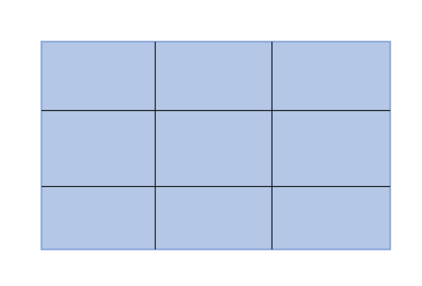
At each intersection of a horizontal and vertical line there is a point, four points total. These are focal points that the eye is naturally drawn to when looking at an image, top left to bottom left then top right to bottom right. Anything you place at or near these focal points will be more noticeable, anything placed away from these focal points will less noticeable. Let’s look at this card design from my last blog post and video:
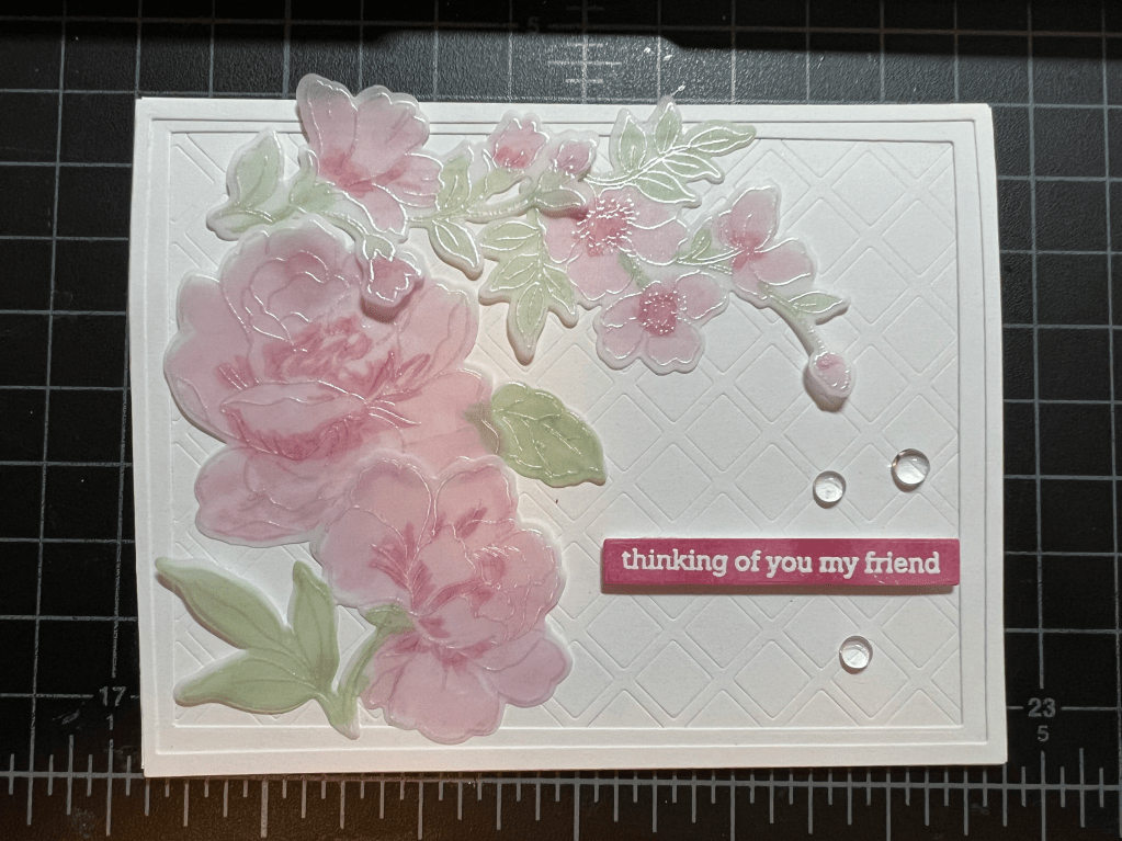
My flower layout is a top left/bottom left – top right/bottom right layout and my focal points (large flowers, flower bud, sentiment strip) are all positioned at the intersection of the horizontal and vertical lines.
White Space:
This brings me to white space, another design element that I consider with each card. A sentiment or greeting against a busy background must have some space in order to stand out. A shadow layer, some vellum, stamping or embossing on a white background, leaving a perimeter – these techniques all help to draw the viewer’s eye to the message you are trying to convey with the card. Here is an example:
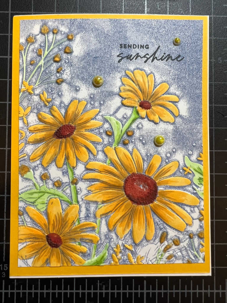
This is a very busy card front, but my sentiment is stamped top right (eyes are drawn here) and it is set off against the lighter blue inking of the sky with lots of space all around.
Golden Ratio:
This one is mathy-fun. It is the 1:1.618 principal and it is found throughout nature so we, as humans are already very used to seeing it all around us, even if our conscious minds don’t pick up on it. You may have heard it referred to as the Fibonacci sequence and it looks like this:

The relationship between these two shapes is the Golden Ratio. Have you seen this basic card layout before…like, everywhere? Sometimes we create layouts using this principal without even knowing it because, as designers we often create layouts based on instinct (does this look right? It needs something…. or, YES! That’s it.) My Rose card above follows this principal and I wasn’t even trying. Your instinct for a great card design might be fueled by the perfection of nature! And you can carry this rule out further in a card. Just keep applying the rule to the smaller rectangle, thereby creating smaller rectangles until your design is complete. This also applies to circles, and any other shape. (Admittedly it could get a little complicated with complex polygons and I probably won’t go there.)
Hierarchy:
Okay, let’s talk size. Larger elements grab your attention. For this butterfly card I wanted the butterfly to be the focal point of the card. I intentionally made it the largest element on the card and placed it at the center of the card, at all four intersection points. Did your eyes follow the “butterfly – Hello greeting – sentiment strip – embellishments path? That’s all about size.

Design is really exciting, don’t you agree? And we haven’t even covered color! Topic for another day (blog post.) Thanks for joining me on this design journey. Happy cardmaking!
Cheers!
Cynthia
